
The Netball World Club Championship is a proposed international tournament featuring twelve elite netball clubs from Australia, New Zealand, South Africa and the United Kingdom. The competition brings together clubs from major domestic leagues, including Suncorp Super Netball, the Victorian Netball League, the Telkom Netball League, the ANZ Premiership and the Netball Super League.
Australia will be represented by three Suncorp Super Netball clubs and one Victorian Netball League club. South Africa will be represented by two Telkom Netball League clubs. New Zealand will be represented by three ANZ Premiership clubs. The United Kingdom will be represented by three Netball Super League clubs.
The tournament is scheduled to take place from 16 September to 30 September 2028, following the Los Angeles 2028 Olympic and Paralympic Games. This timing allows elite netball to leverage global sports momentum, offering maximum exposure for players, clubs, and sponsors and allowing the sport to reach new audiences. It creates an opportunity to build attention around elite netball and support the sport’s wider push for inclusion at the Brisbane 2032 Olympic Games.
The main goal is to boost visibility, viewership, and attendance for elite netball. The project draws inspiration from the 2023 FIFA Women’s World Cup. That event boosted the profile of women’s sport worldwide.
This capstone project meets that opportunity by building a professional tournament identity, campaign system, and communications suite. The design challenge is to present elite netball as a world-class product that is global, prestigious, and commercially strong. It must be able to communicate effectively with both new and current netball fans.


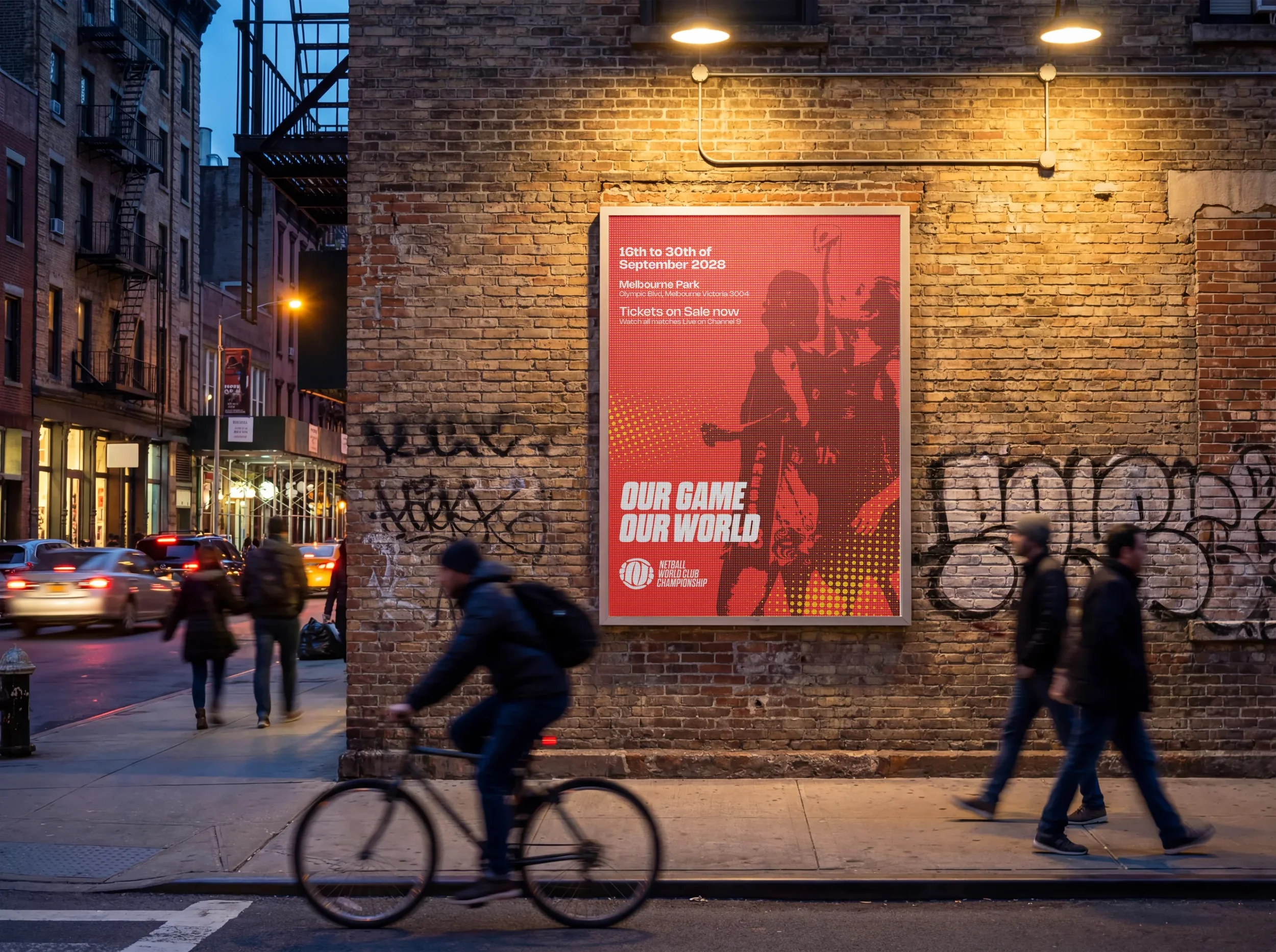
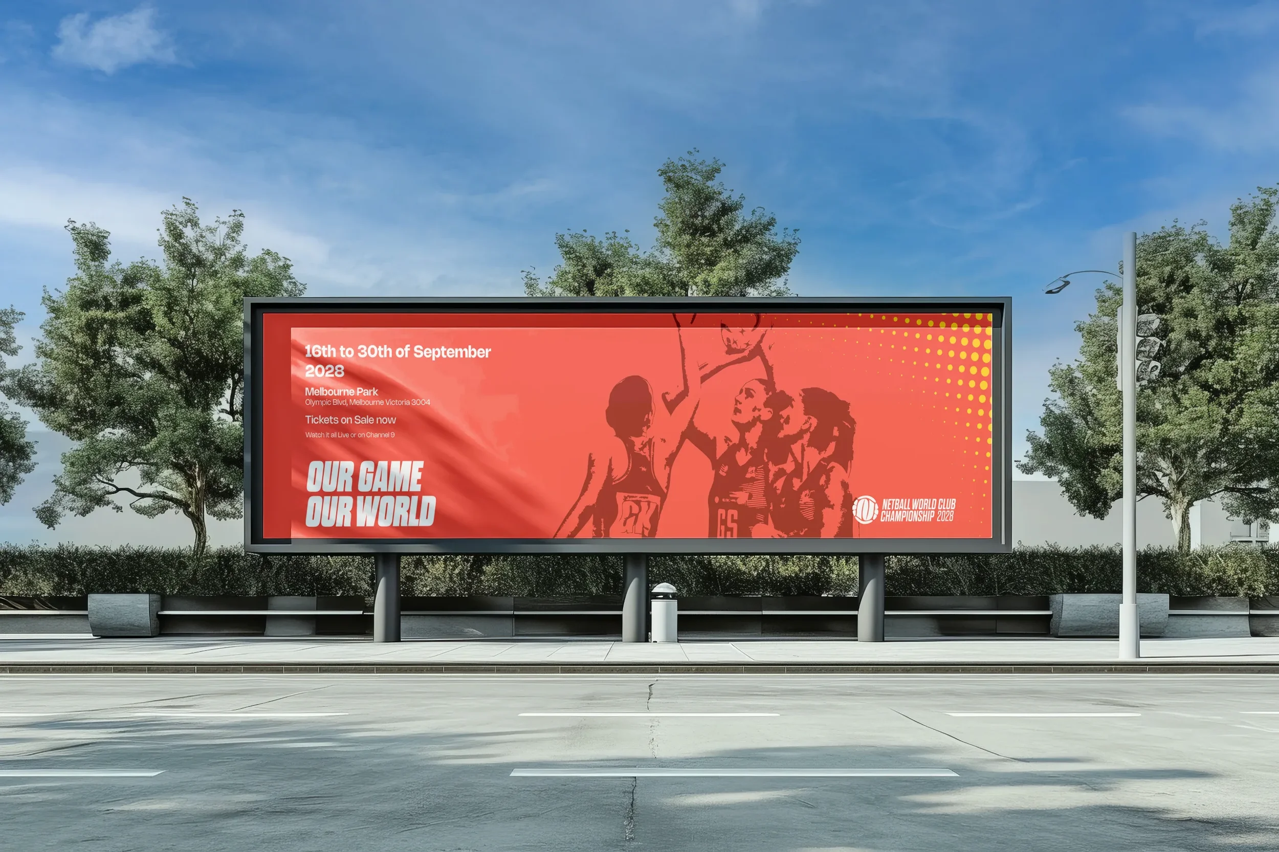


Primary Audience
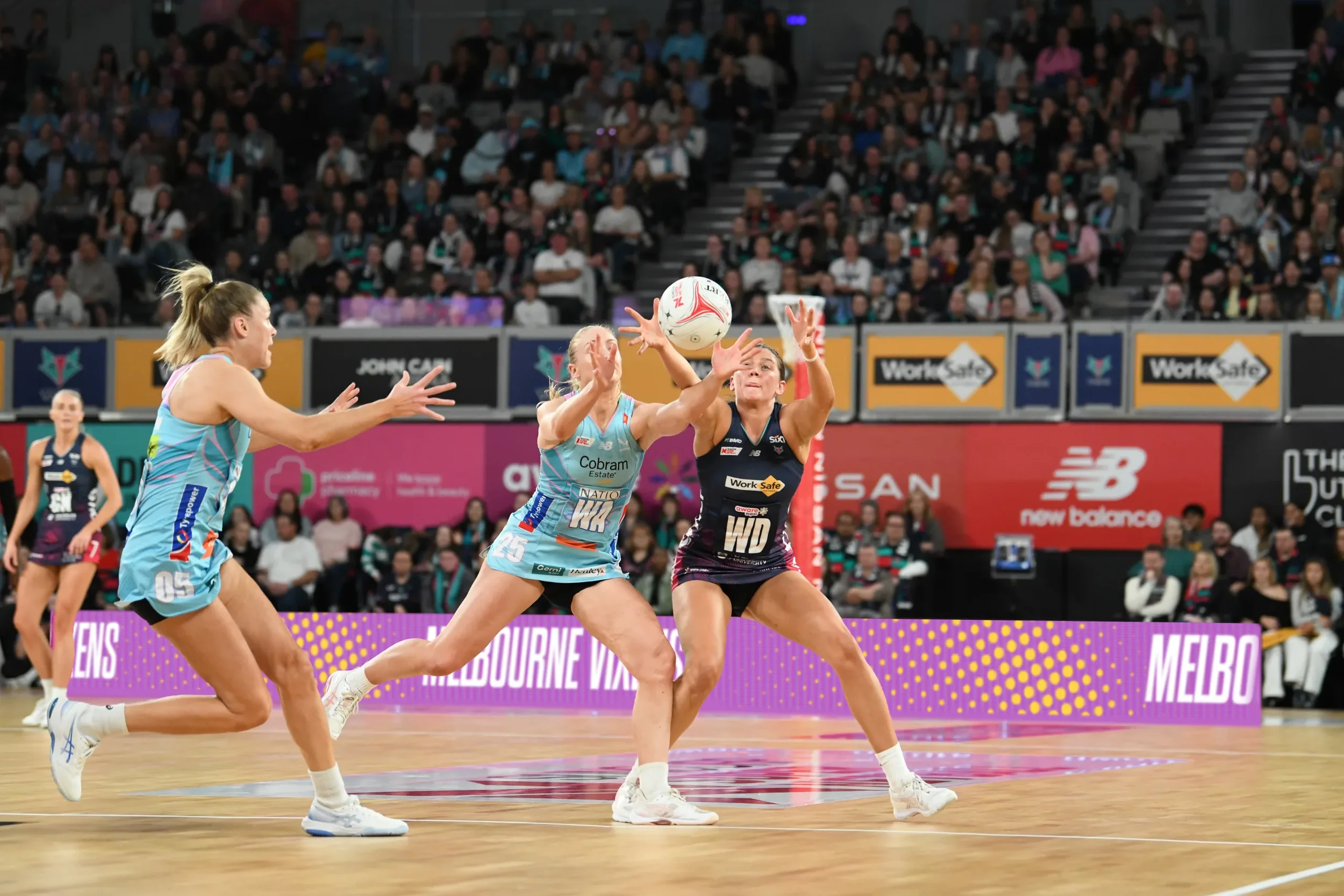
The primary audience consists of Followers and Flâneurs, who engage with sport through product-mediated and virtual relationships, forming connections through media, digital platforms, and market identity rather than direct participation (Giulianotti, R. 2002). For the World Netball Club Championship, this audience is important for growing global awareness, as they respond to strong visual identity, broadcast presentation, and engaging social media content that positions the event as a contemporary international competition.
Secondary Audience
The secondary audience consists of Fans who engage through symbolic exchange relationships and demonstrate a flexible connection to sport, depending on the accessibility and relevance of the competition (Giulianotti, R. 2002). For this project, fans may already consume international sport and can be encouraged to engage with netball through a clear competition structure, strong athlete representation, and consistent
professional branding.
Tertiary
The tertiary audience consists of Supporters, characterised by a traditional sporting culture and strong solidarity, forming strong emotional connections to teams, communities, and the sport’s identity (Giulianotti, R. 2002). Within the World Netball Club Championship, this audience includes existing netball players and communities who provide authenticity and credibility to the competition while supporting long- term engagement.


The Logomark is broken into two parts, all formed and designed from the shape/ form of a netball. The outer ring references the globe “World”, and the N is for Netball, which, when put together, forms the logomark and netball. For a sense of Motion and without looking like a mistake, a 7° rotation is used for the logo, which is similar to the slanted italic type used in the full logo lockup.


Logomark

Primary Logo
Workmark


Lockup A

Lockup B

Lockup C

Lockup D

Lockup E

Lockup F

#F16E62
#722D26
#A14941
#F8A668
#FFD846
#241F21
#FFFFFF

#BC67C7
#3D003C
#520048
#7B2287
#D18FDE

#00A5E6
#00375A
#02578A
#0082C5
#90C8EC



Colour
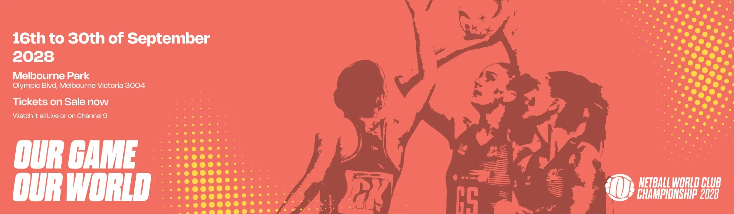
Primary Colour Palette, Uses Warm Colour “Oranges “ for the Tournament Base used in promotional Graphics and other graphics when designing for the whole tournament and not one of the two pools.
The Secondary Colour Palette are the Two Pools, both use cool colours for a contrast to the Warm tones of the Base colour palette.
Pool 1, Uses Purples & Pool 2 uses Blues.
For the Halftone pattern on both Tournament “Orange” and Pools “Purple & Blues” Uses yellow colour for the Pattern for contrast and connection between all palettes.

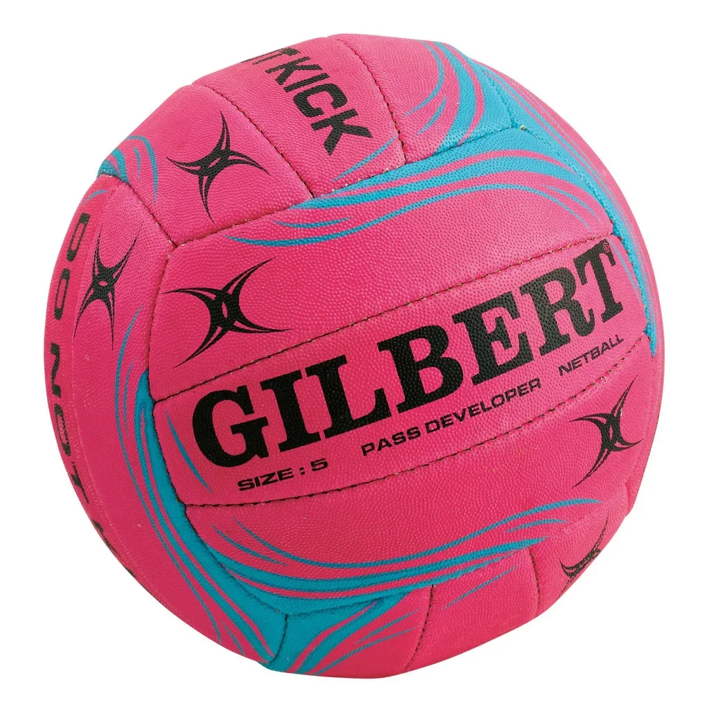
Halftone Pattern to replicate the grip pattern on the Netball ball.
Dynamic Shapes of the halftone pattern similar to what brands of Netballs use on their balls.
In both Communication design of the Tournament Graphics and Both Pools use the colour Yellow as the Halftone pattern on every graphic and doesn’t change colour.


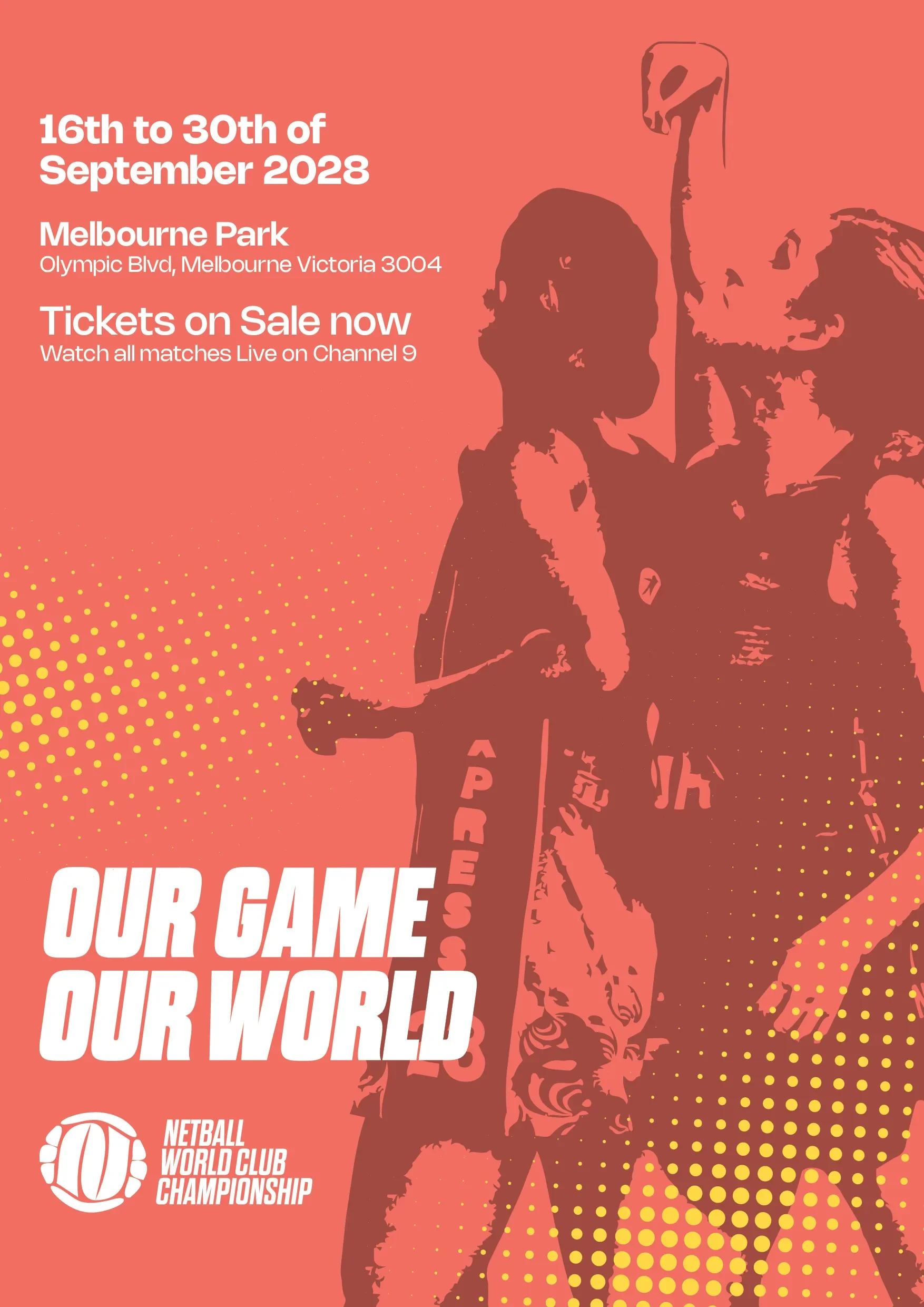
Tag Line “Our Game, Our World”
Provides a sense of ownership to the Elite Netball Players and Clubs.
The tag line has repeatability as well following the same pattern of the “Our Game, Our World” and keeping the sense of ownership of the tagline both The “Our” is kept and is then turned into some other taglines, that then can be used for Touchpoints, Video Elements, etc.
Our Game, Our World (Main)
Our Court, Our Crown


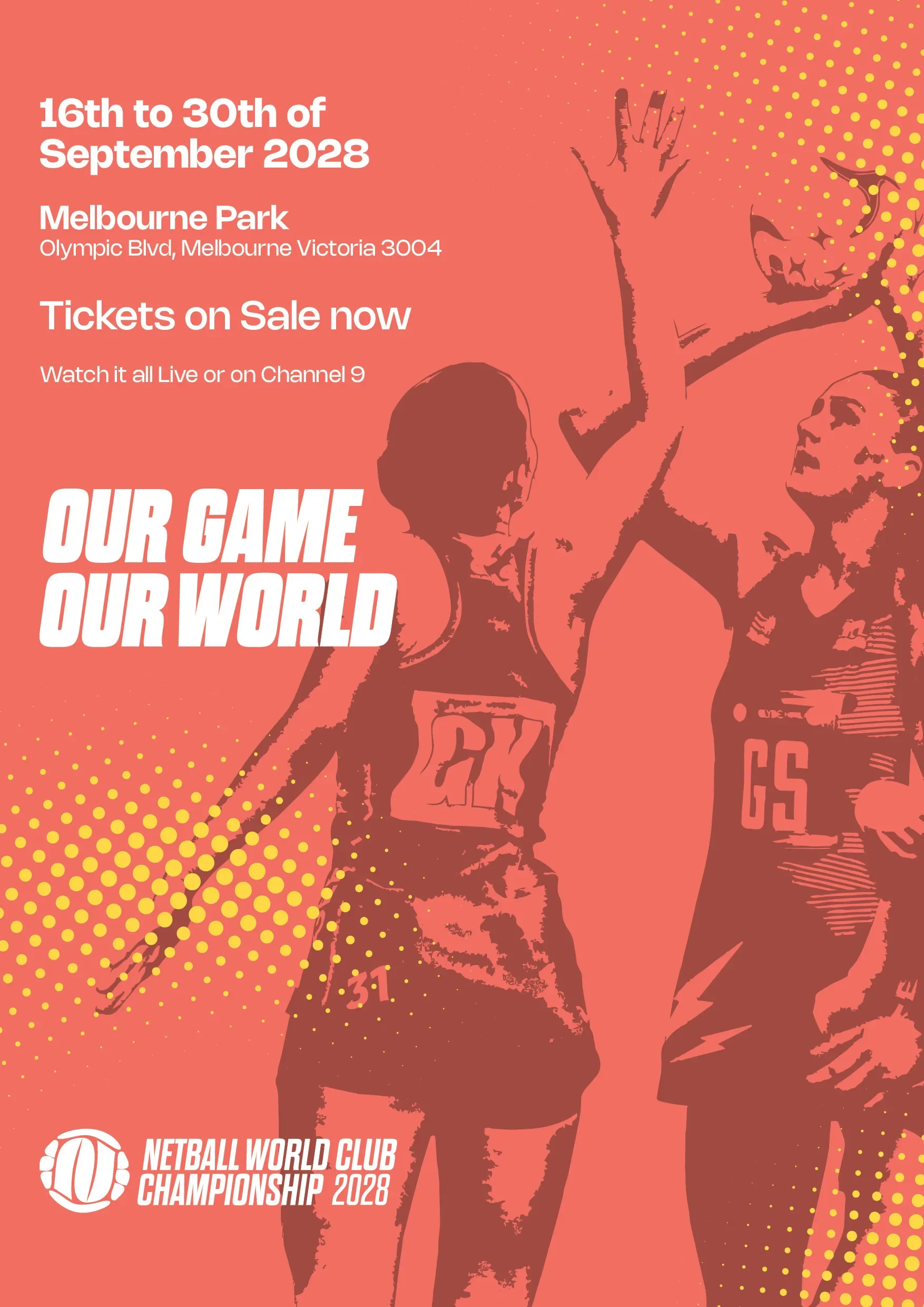
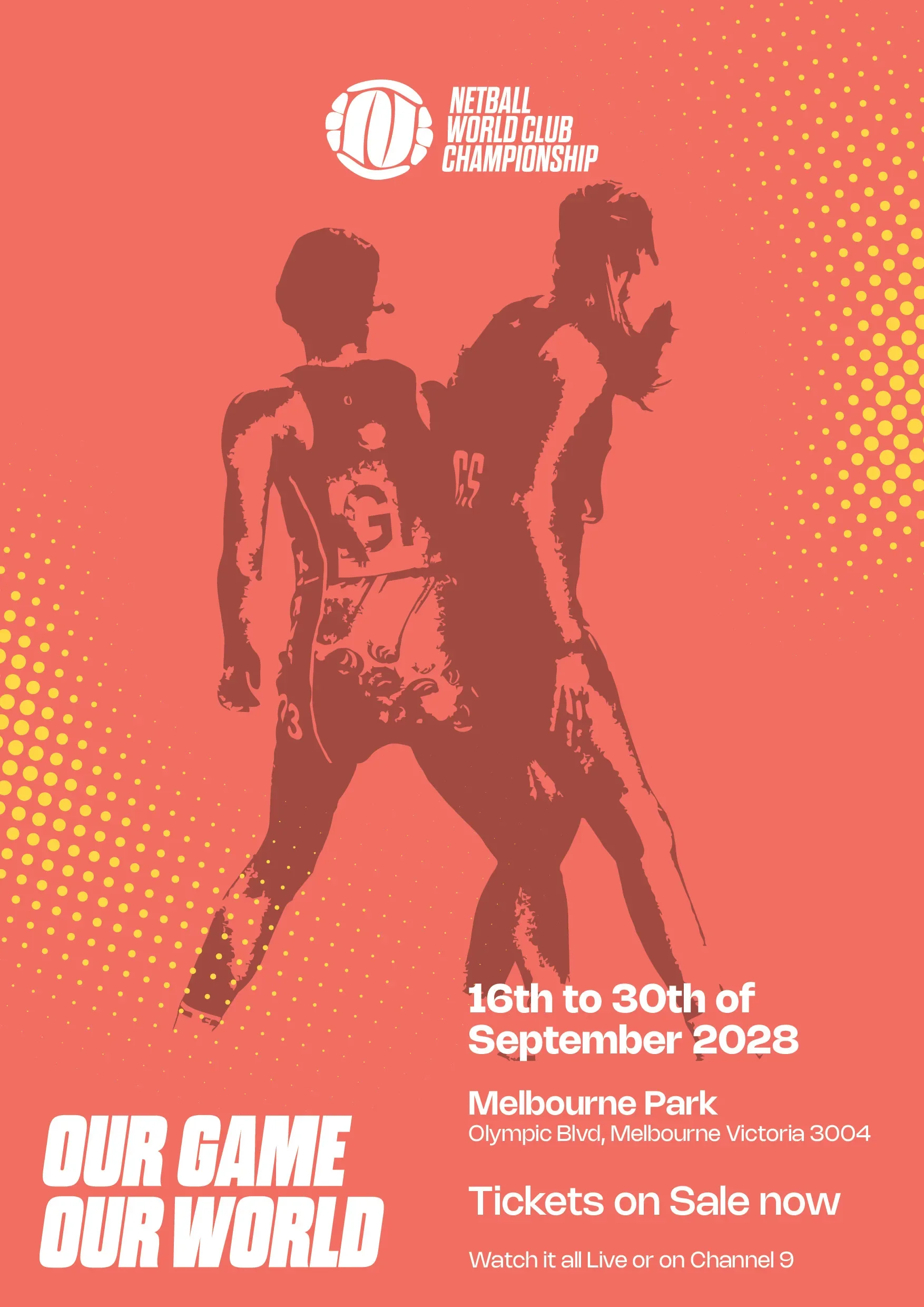
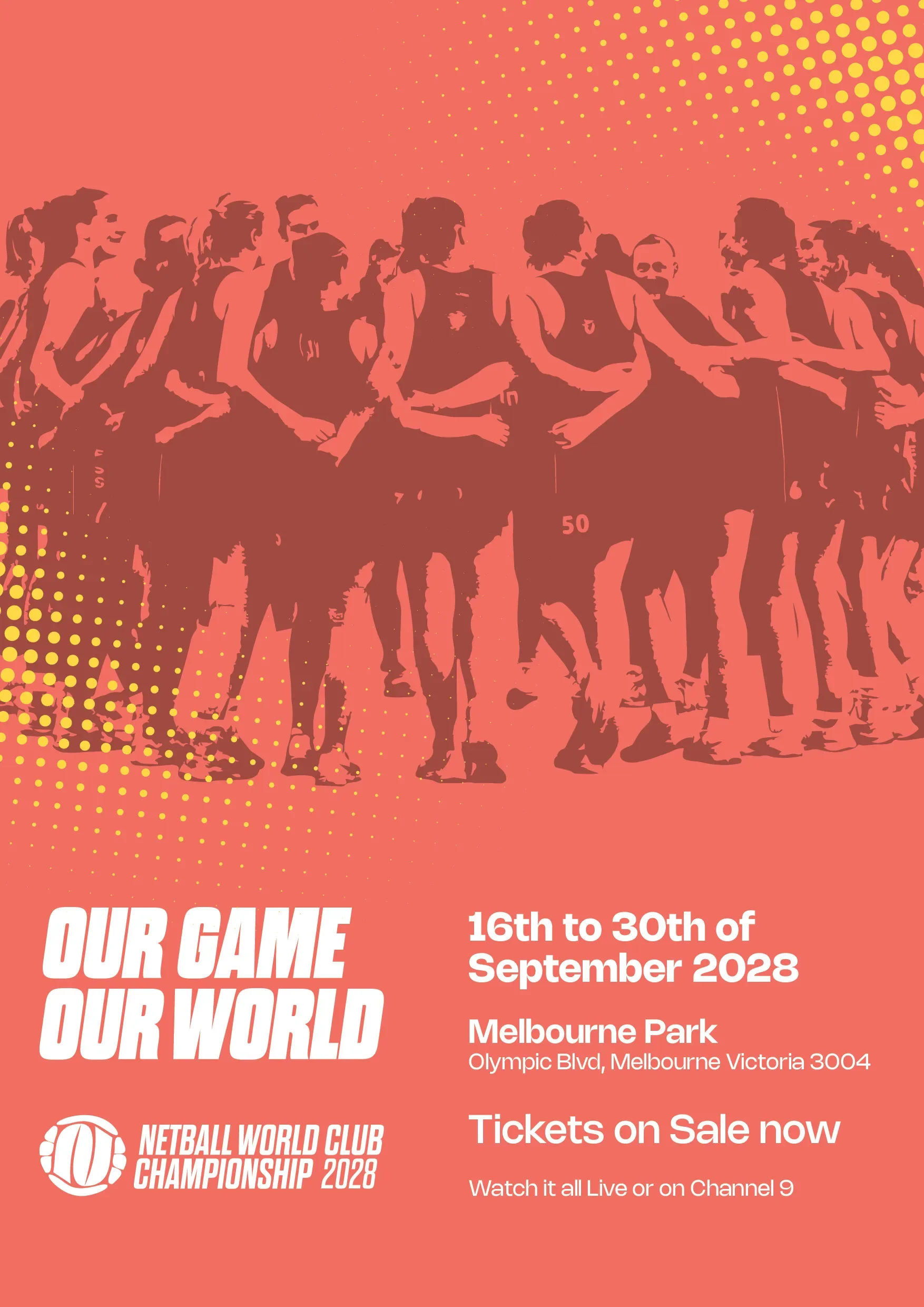


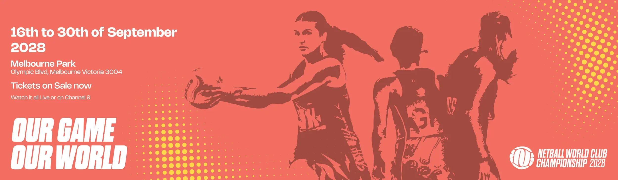




The LED Display Ribbons would feature inside of the stadium on Court.
Currently Static Graphics, But Motion design can work with these designs.
The Dragon V Panthers LED Display would go in the Right Direction, and for the Super Goal LED Display that would have a radial effect from the halftone pattern.
Top: Would feature on the outside of the stadium during matches or between matches. Rod Laver Arena Front would be where it can be located.
Middle: Swapped for whichever pool is being played, but would show up when a super goal is shot in the last 5 minutes of each quarter.
Bottom: this would appear at the start of games, as patrons enter the stadium and players warm up.

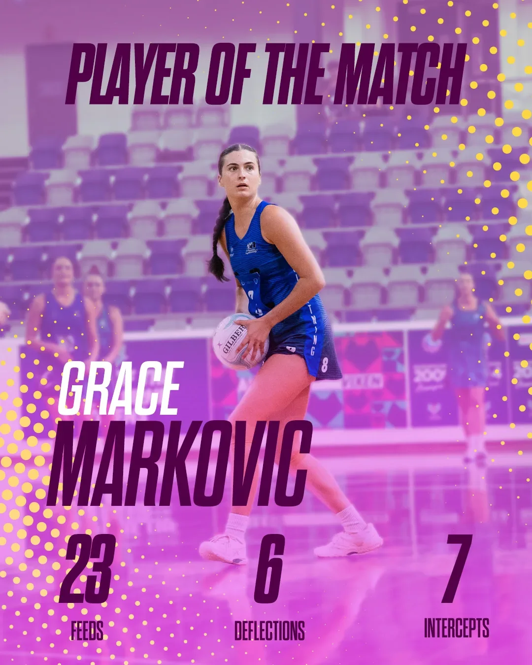
Post A Player of the Game graphic Using Real Imagery from the Game.
Since the team is from Pool One, and purple colours are used for the graphic


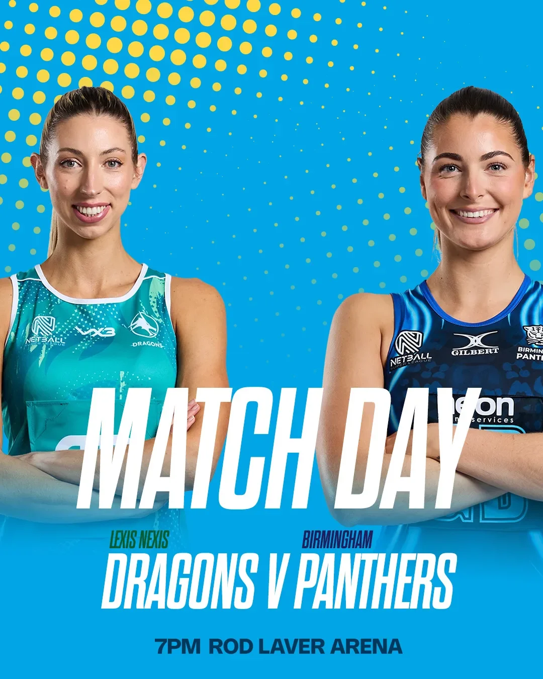
Post B Match Day Graphic Using Media Portraits of two Players
Keeping the structure of the Pool Two Colours

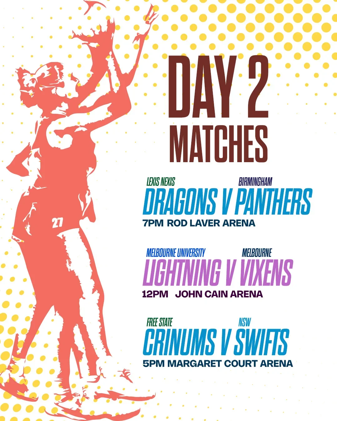
Post C Graphic Photography using Image Treatment
Games Showcase pools in their colour ways while keeping the base tournament colours for the structure around it.


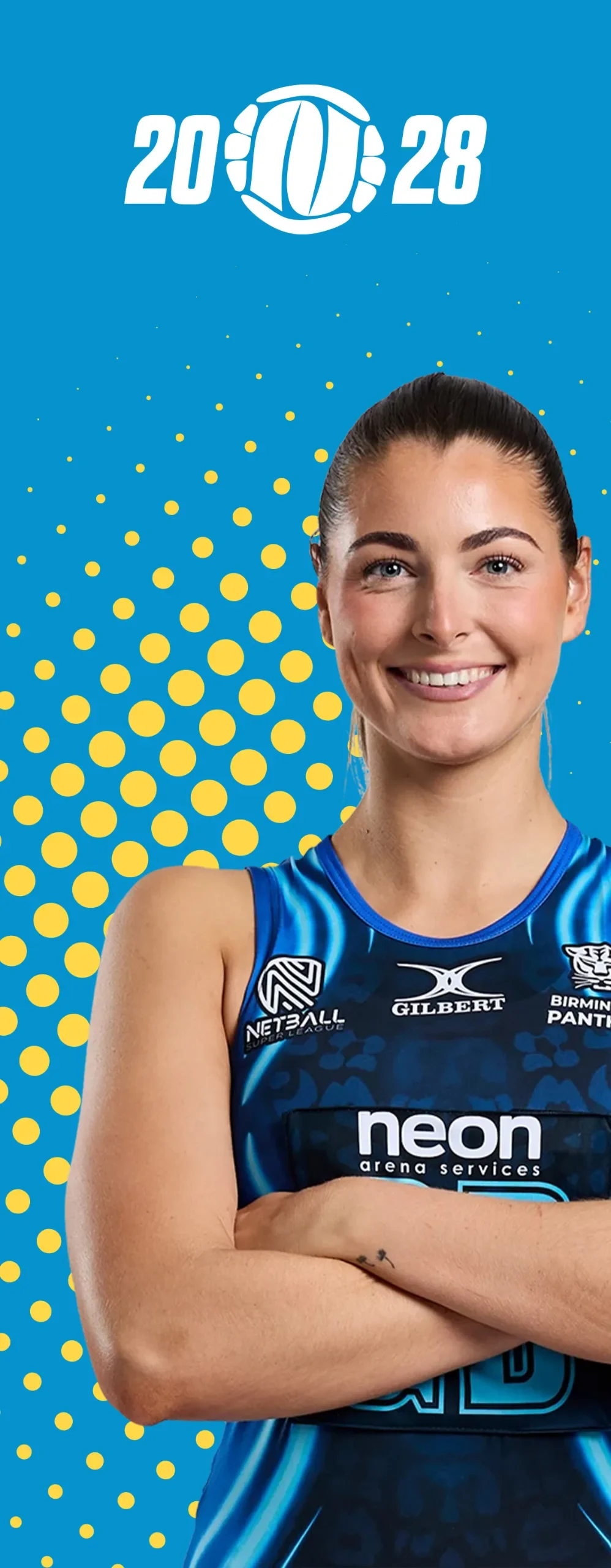
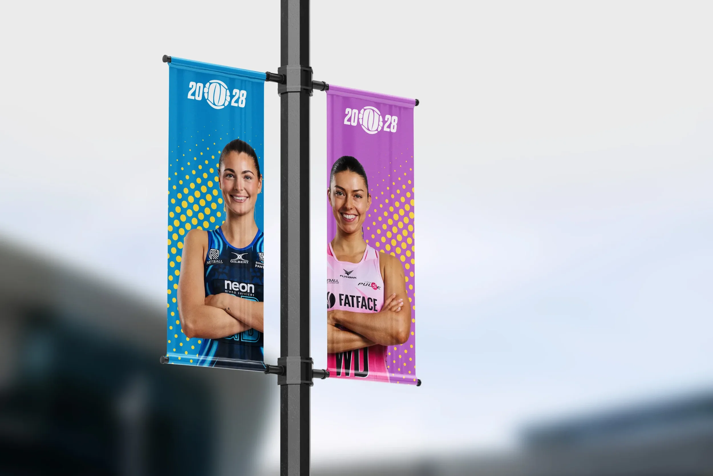
These banners would feature across Melbourne Park, Using Media Portraits of the Player to give a more personal touch to patrons, a face to look up to for the Supporters.
Banners can also be used inside or around the stadium on the day the teams are playing (inspired by what is seen at VNL “Victorian Netball League” Games at State Netball Centre).