

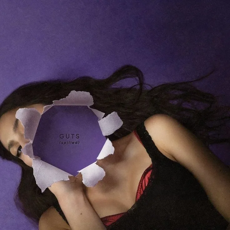
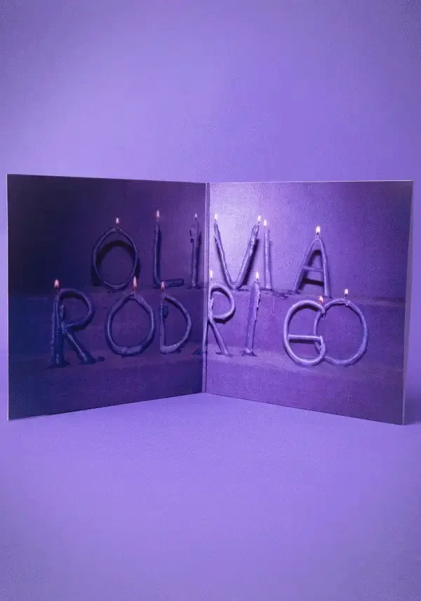
GUTS (spilled)
Album Rebrand
Project Introduction
Project
GUTS (spilled) by Olivia Rodrigo Album Rebrand
Type
University Project
Year
2025
This project is a full rebrand of Olivia Rodrigo’s GUTS (spilled), created for an image-making unit. I was tasked with reimagining the album in a new visual style that moved away from the original release. It was a chance to work with a different target audience and learn a new design style, which pushed me outside my comfort zone. The final work includes a Y2K-inspired photoshoot, new cover art, a gatefold layout, and a full visual direction that shows my skills in planning, styling, photography, and album design.
Olivia Rodrigo
Olivia Rodrigo is a pop artist who has quickly become one of the biggest names in music today. She first started her acting career before transitioning into a music career, breaking through with her debut single, “Drivers License,” in 2021. Her first album, SOUR, showcased a blend of pop and rock influences, focusing on the themes of teenage heartbreak and angst. Her follow-up GUTS (2023) built on that with a louder and more rebellious sound, leaning into Pop Punk, Alternative Pop,
Power Pop.
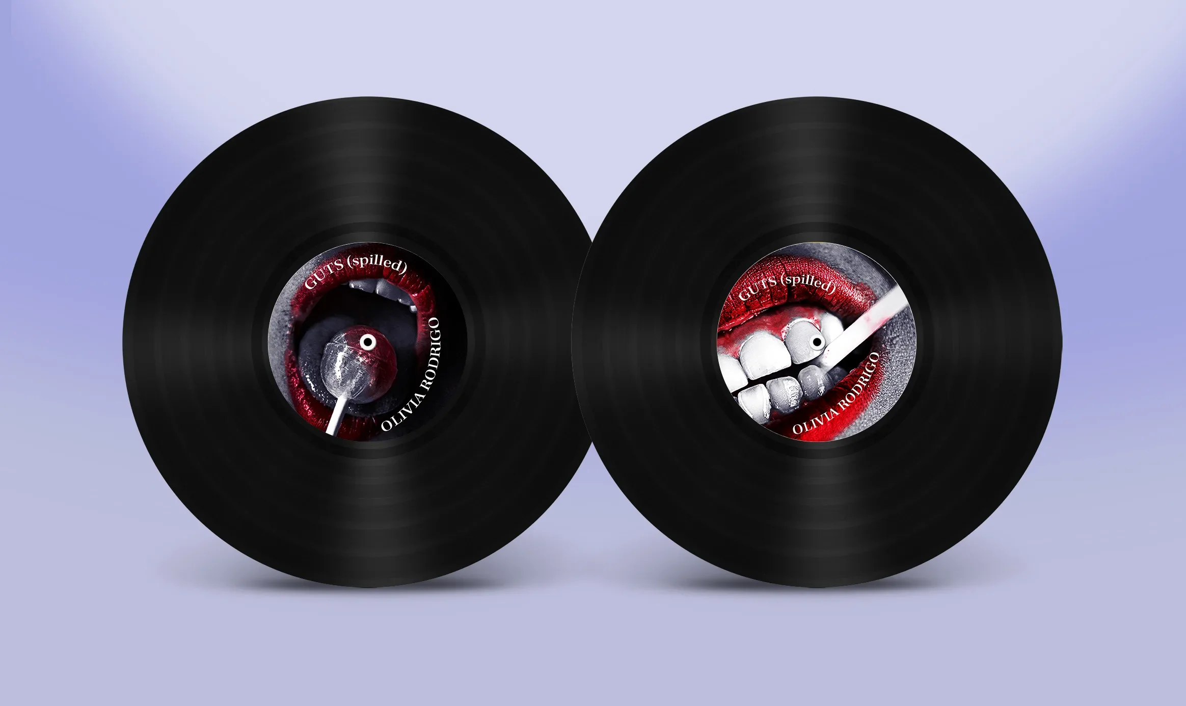
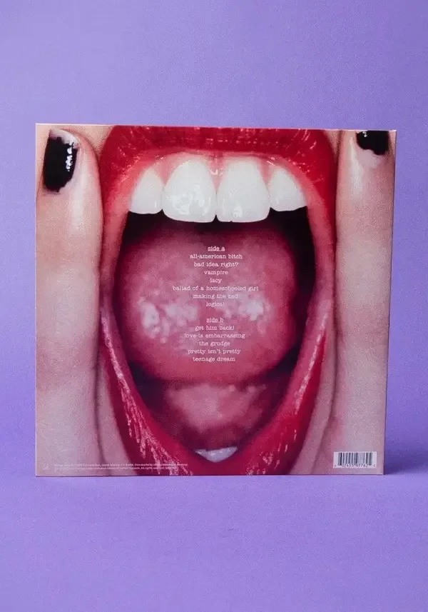
GUTS (spilled) Album
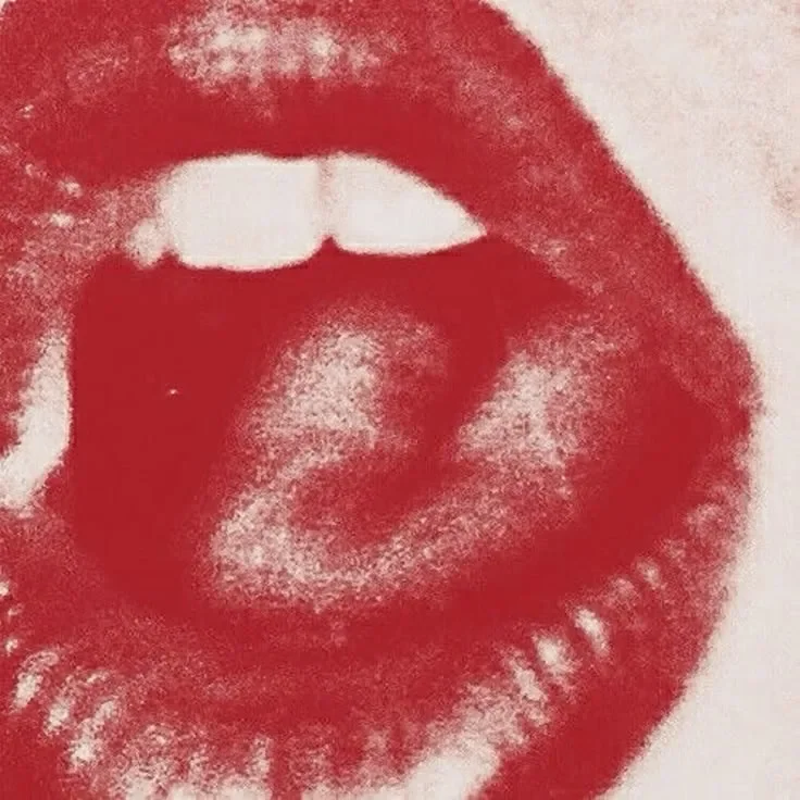
Olivia Rodrigo’s GUTS (2023) is a loud, unapologetic album that thrives in chaos, rebellion, and raw honesty. Unlike the diary-like intimacy of SOUR, GUTS feels like a punk zine, torn and layered with edges, duct tape, lipstick stains, and photocopied flyers, all collaged into one messy collage. The title itself speaks to bravery and exposure: guts as courage, guts as the insides spilled open. Visually, the album evokes the spirit of riot grrrl culture, with its gritty clubs and DIY fan posters plastered across walls. It’s about embracing imperfection, finding strength in flaws, and celebrating the reckless, rebellious energy of youth with bold, unpolished style.
Previous Inventory
RESEARCH
*
RESEARCH *
Target Audience
Gen Z
Young women
Teen to early 20s
Pop rock fans
Alt pop listeners
TikTok audience
Social media users

Visual Direction Moodboard


Initial Concepts

PHOTOMEDIA
*
PHOTOMEDIA *
Photoshoot Shot List
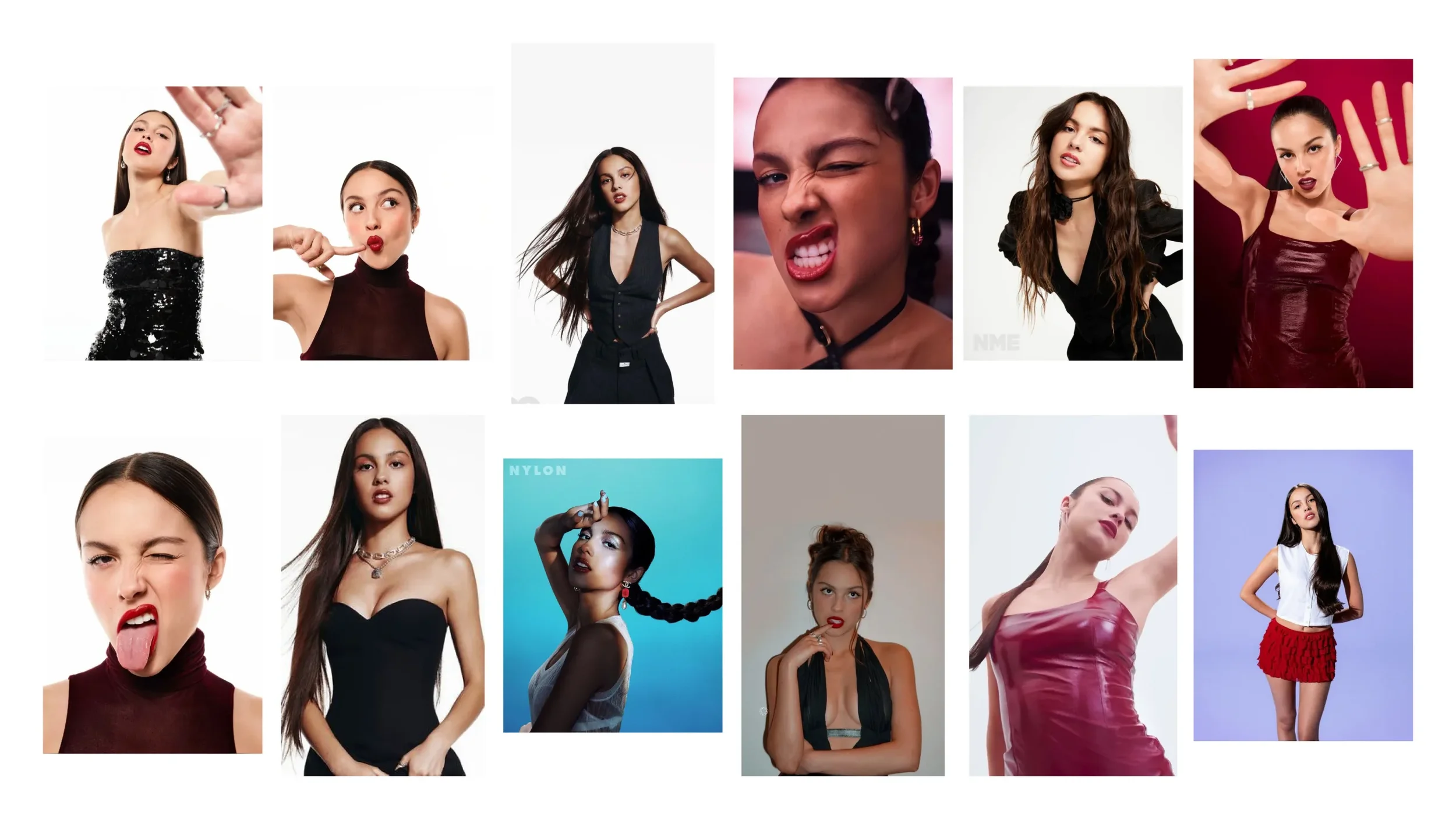
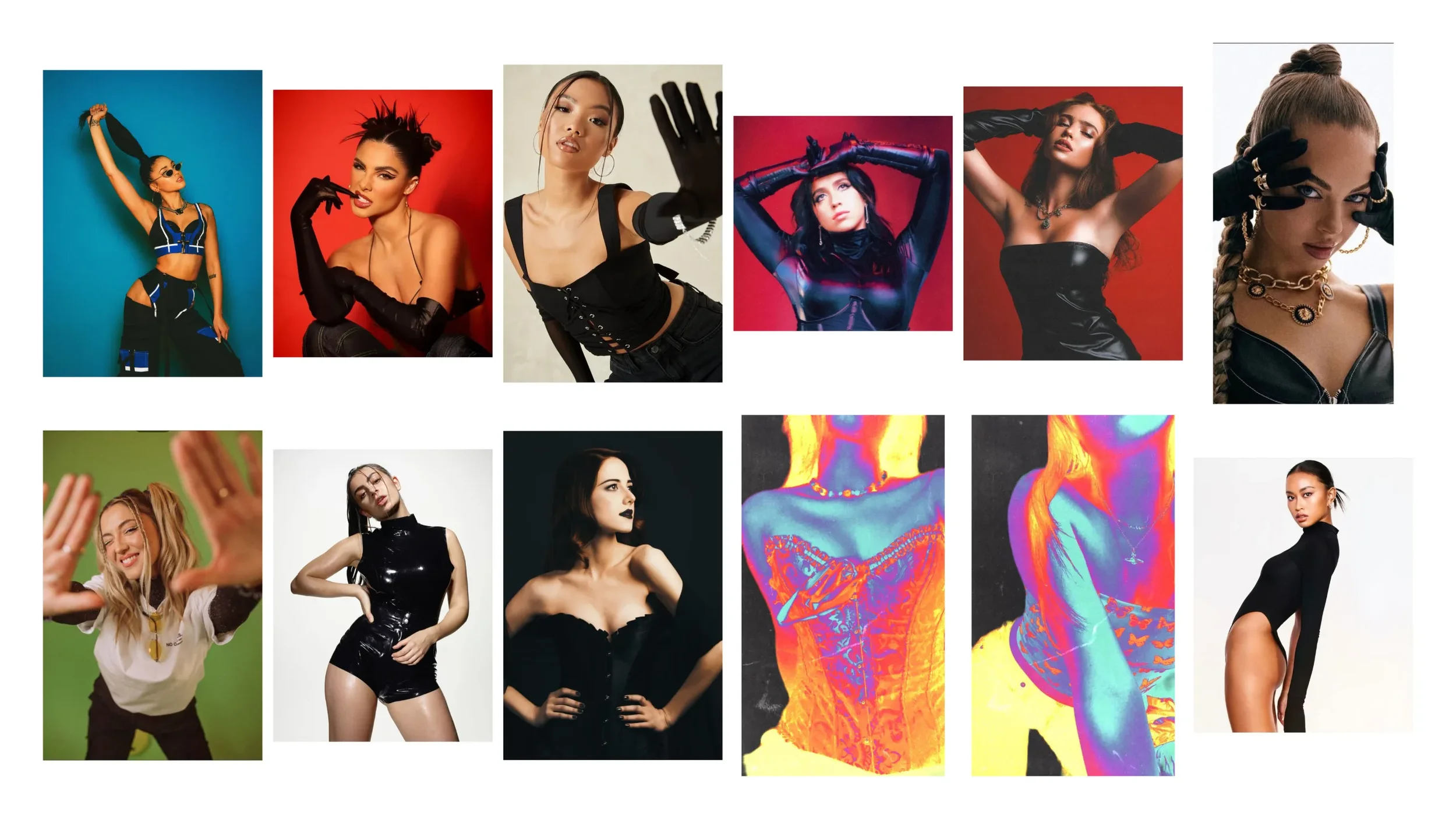
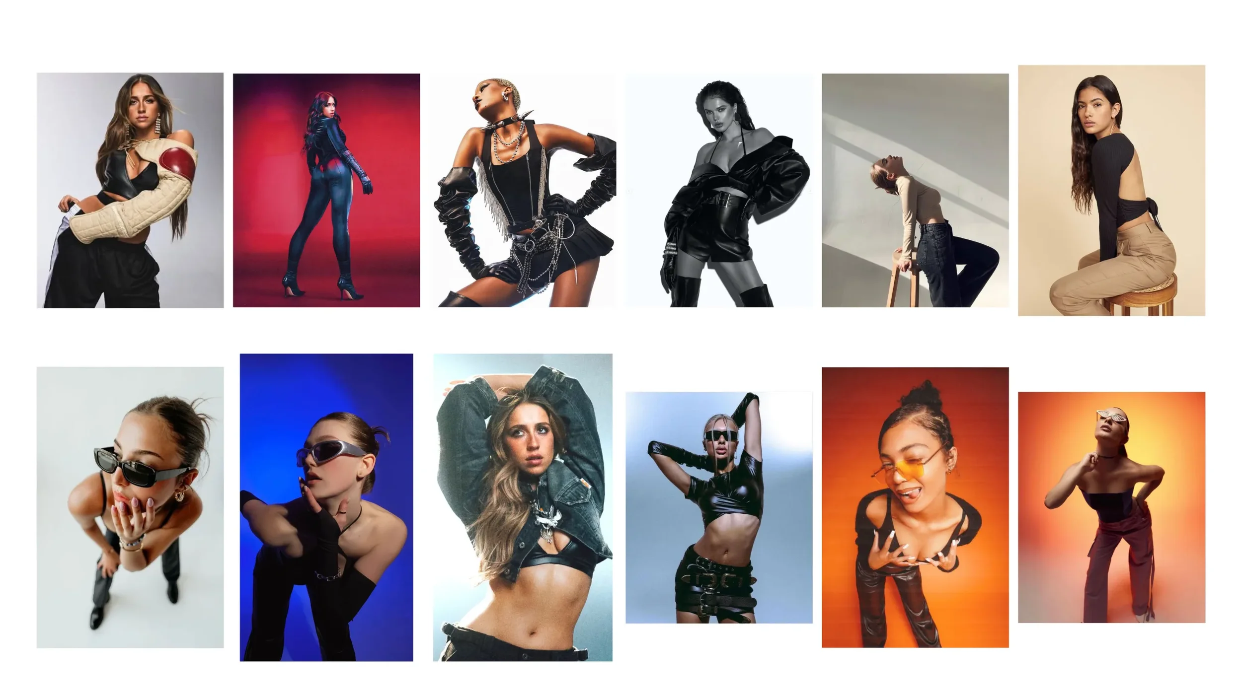
Photoshoot Contact Sheet
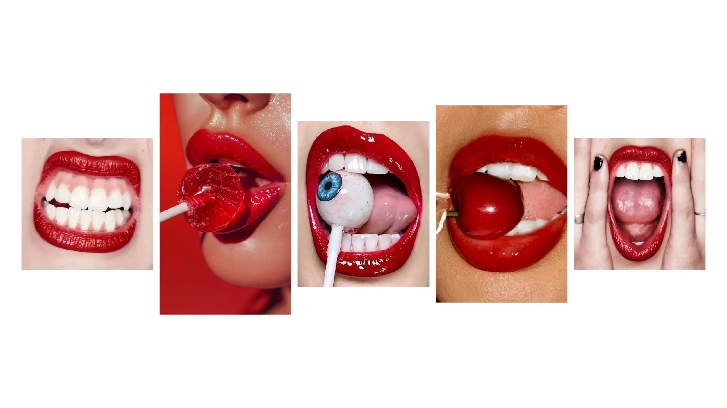
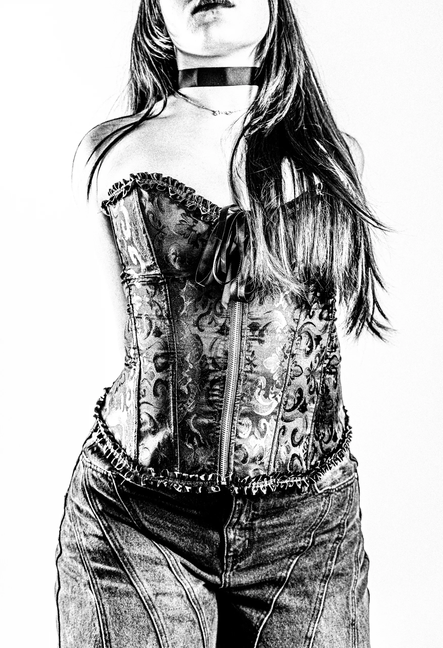
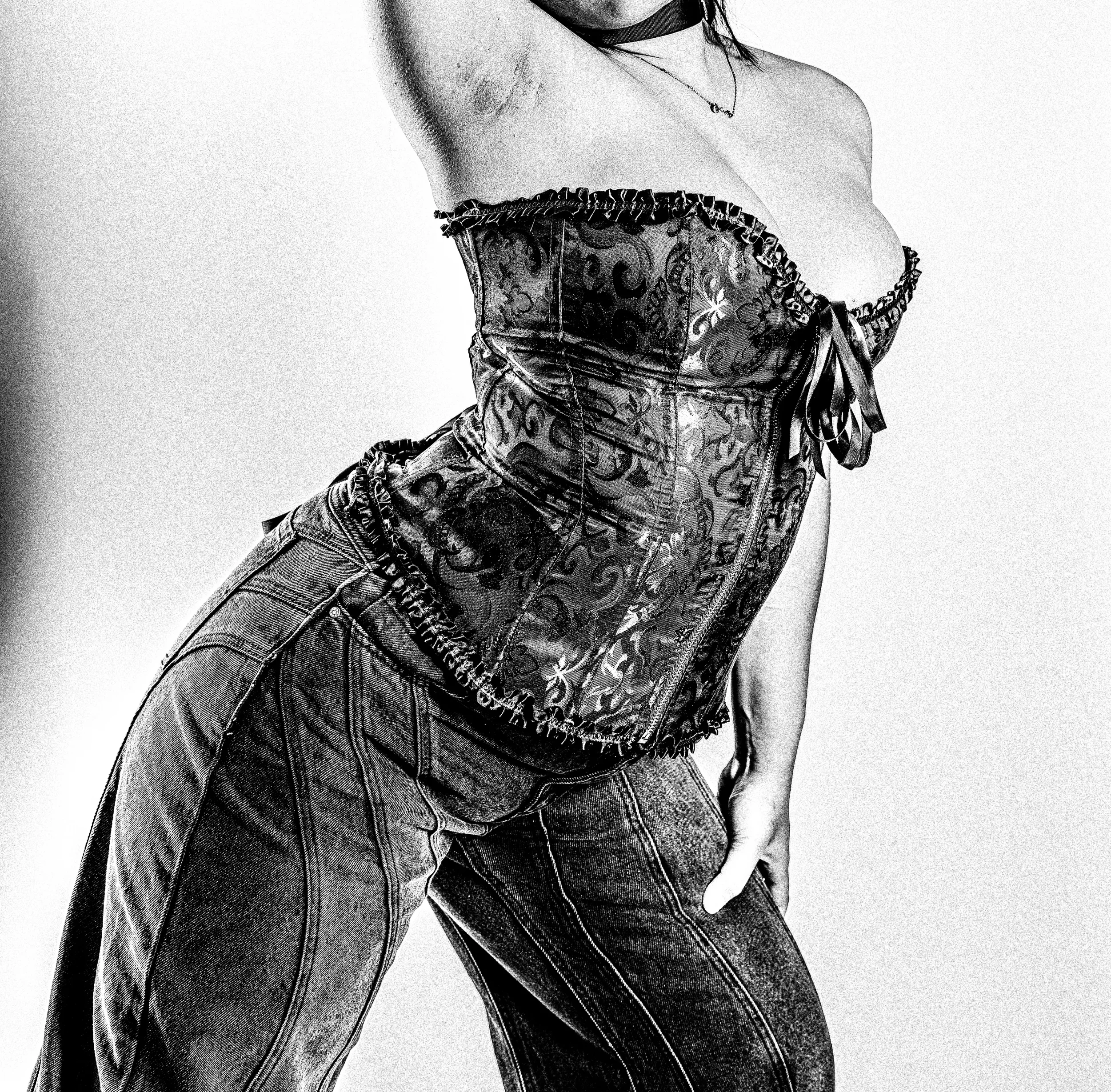
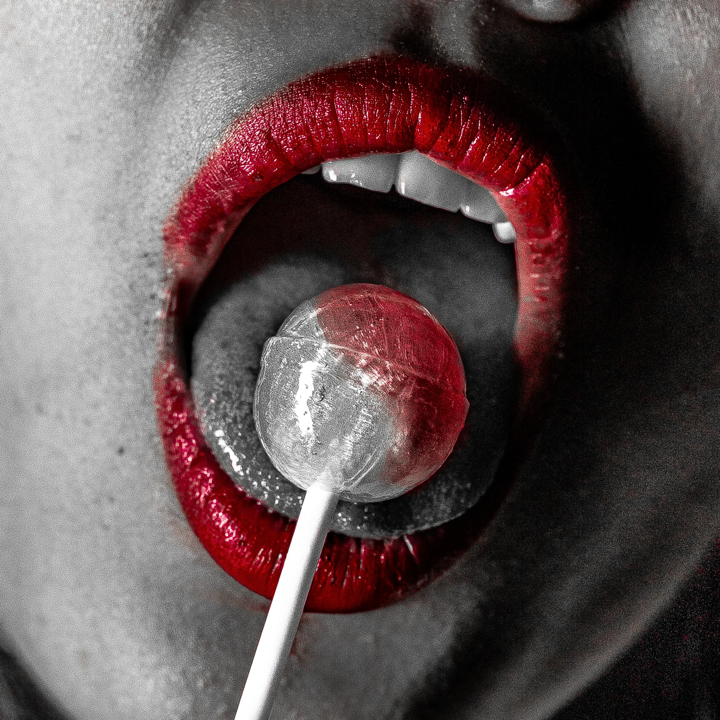
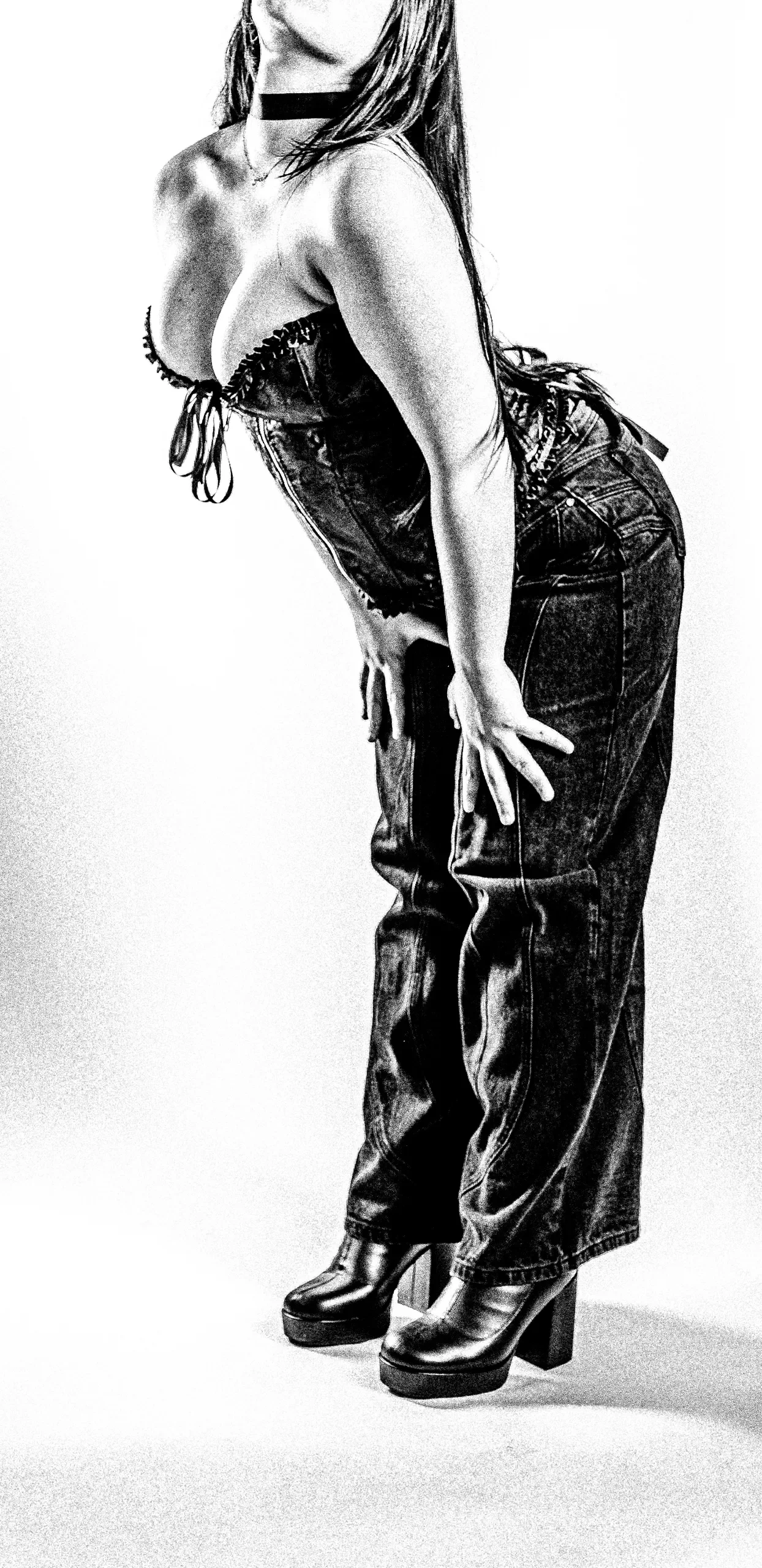
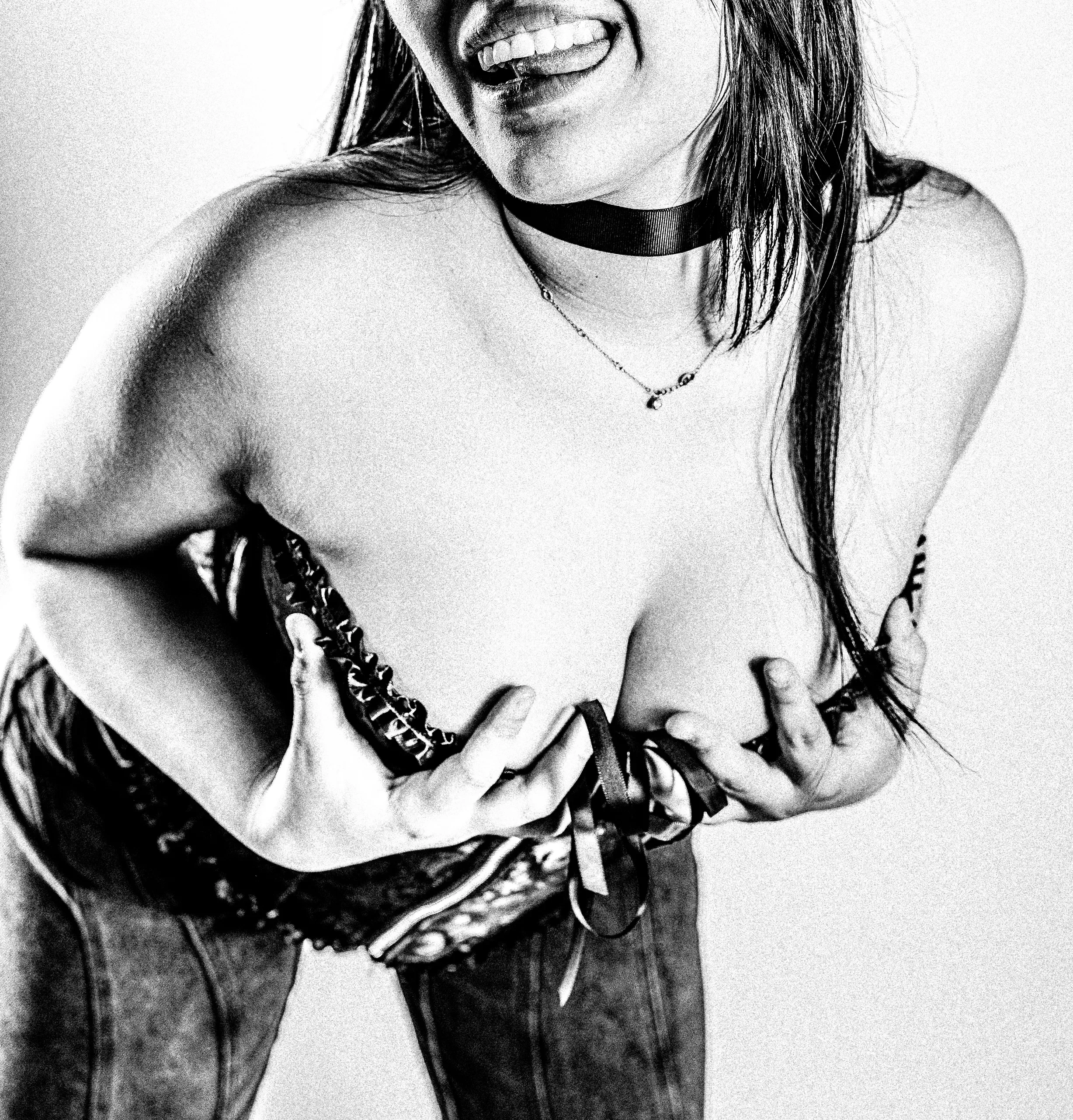
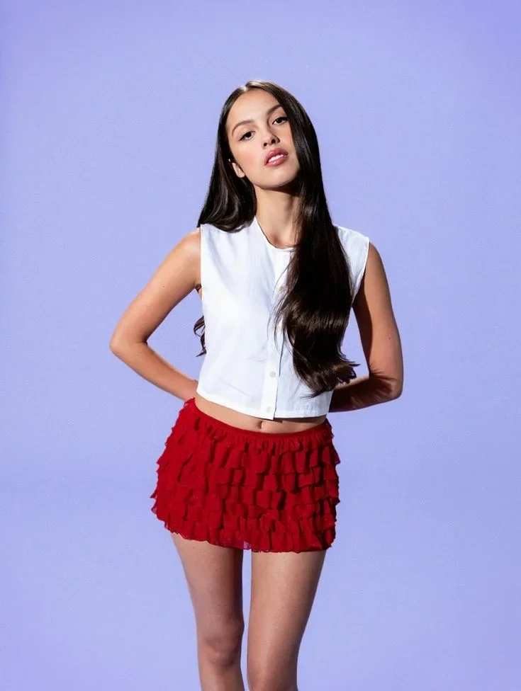
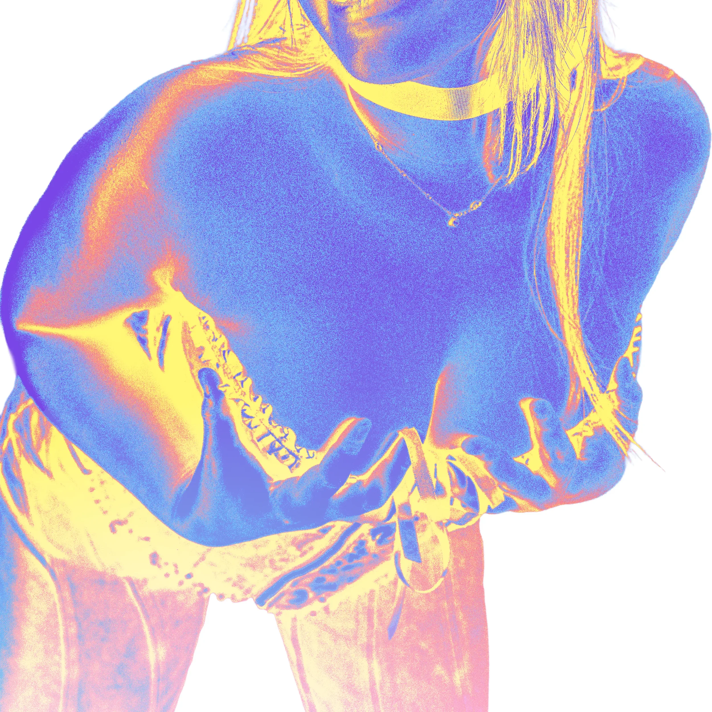
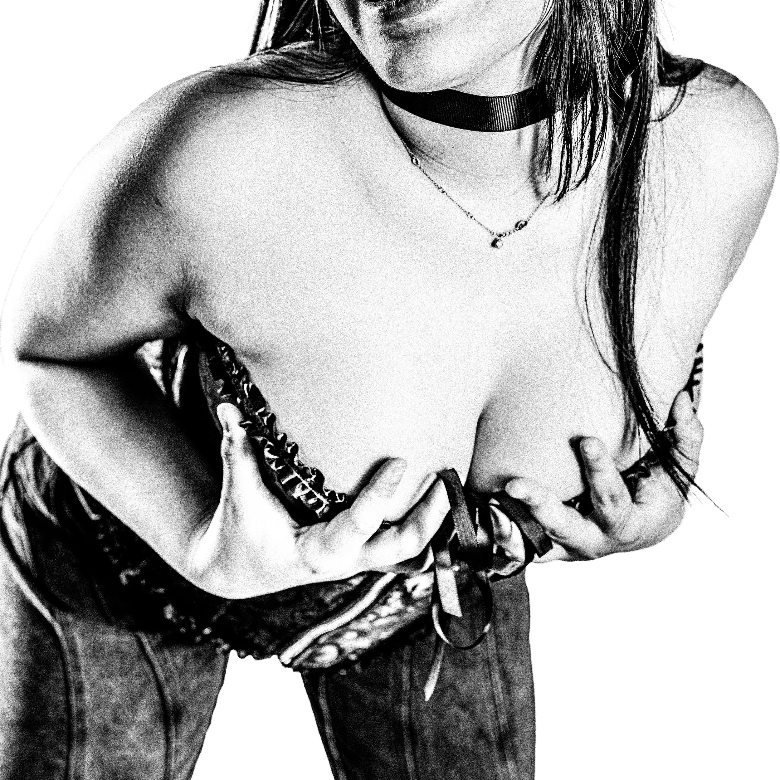
Portrait Treatments
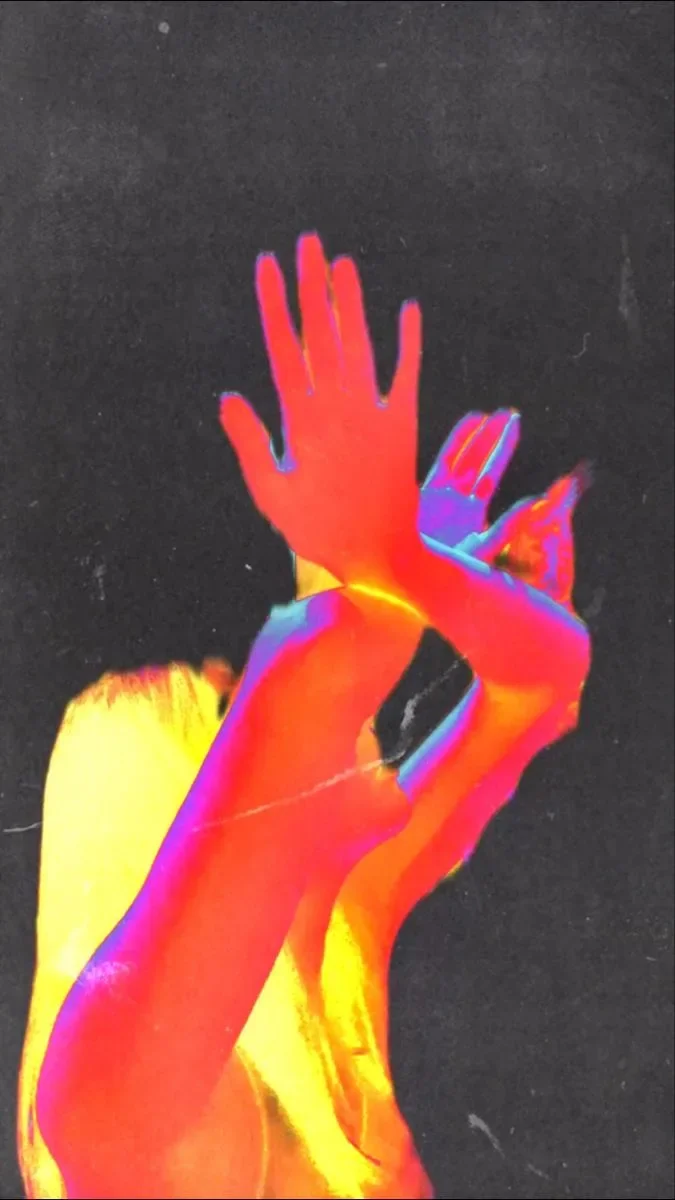
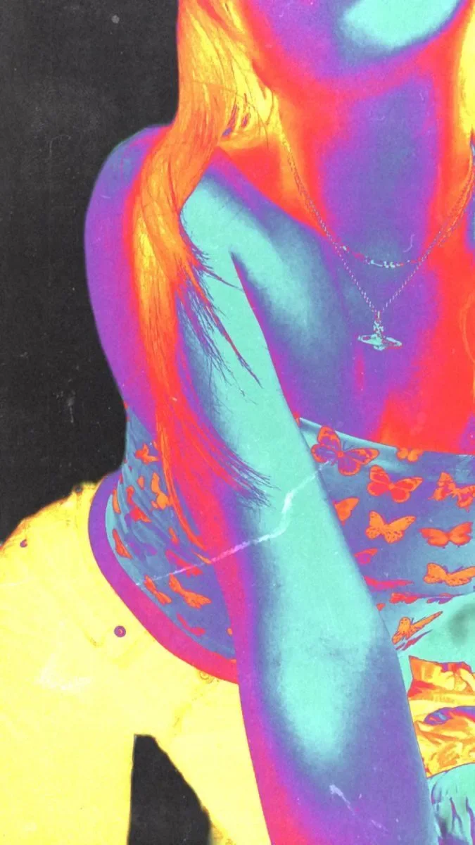
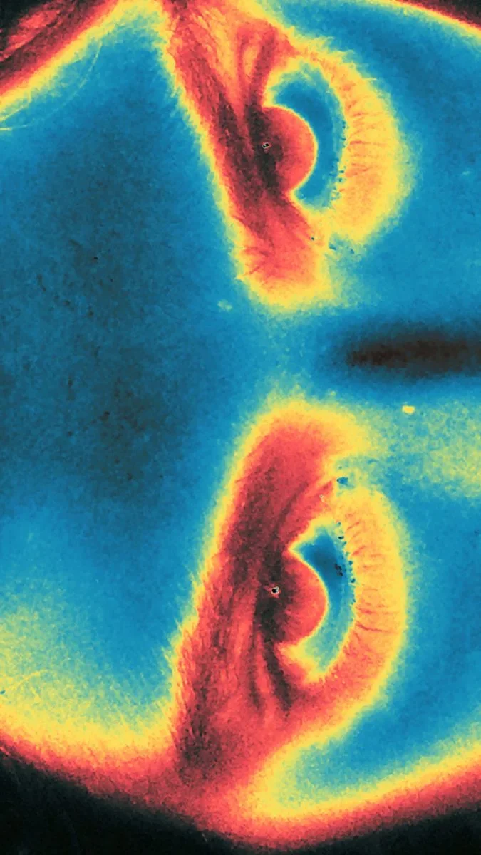
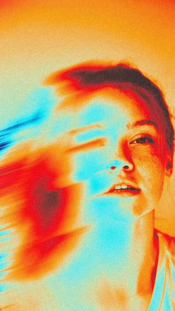
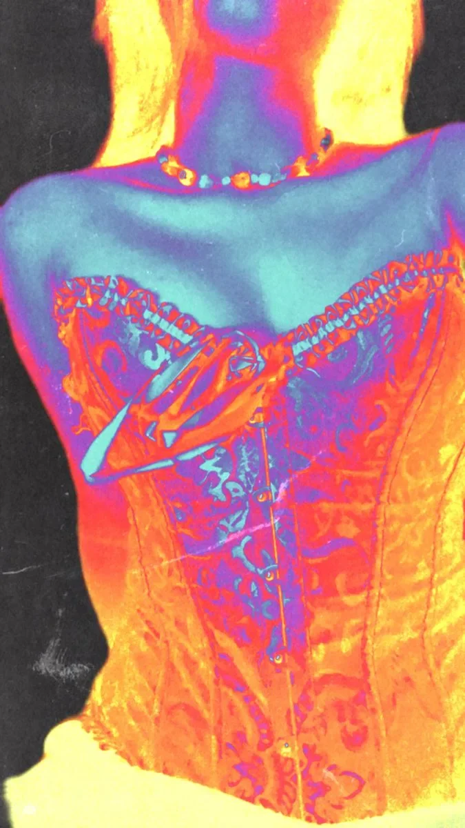
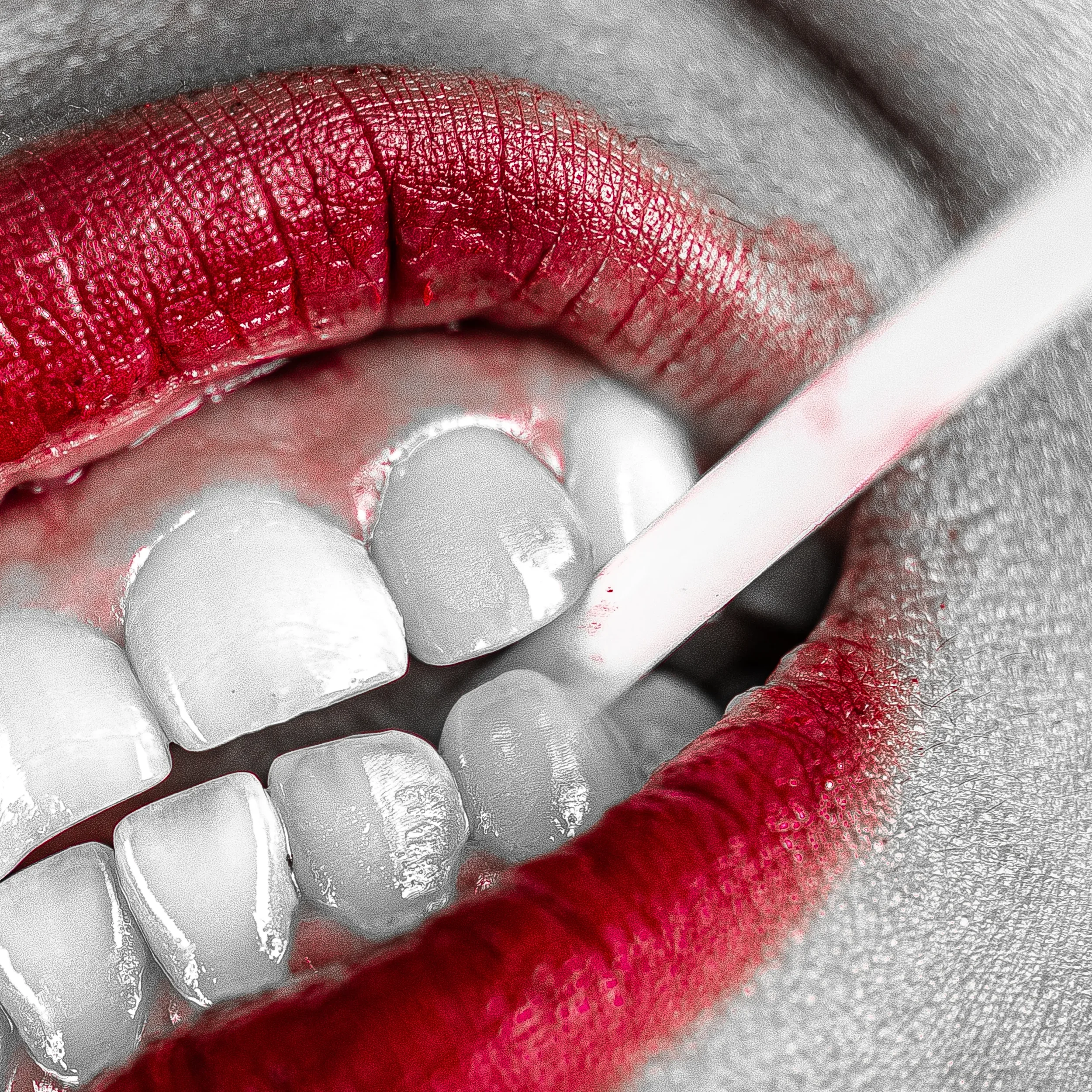
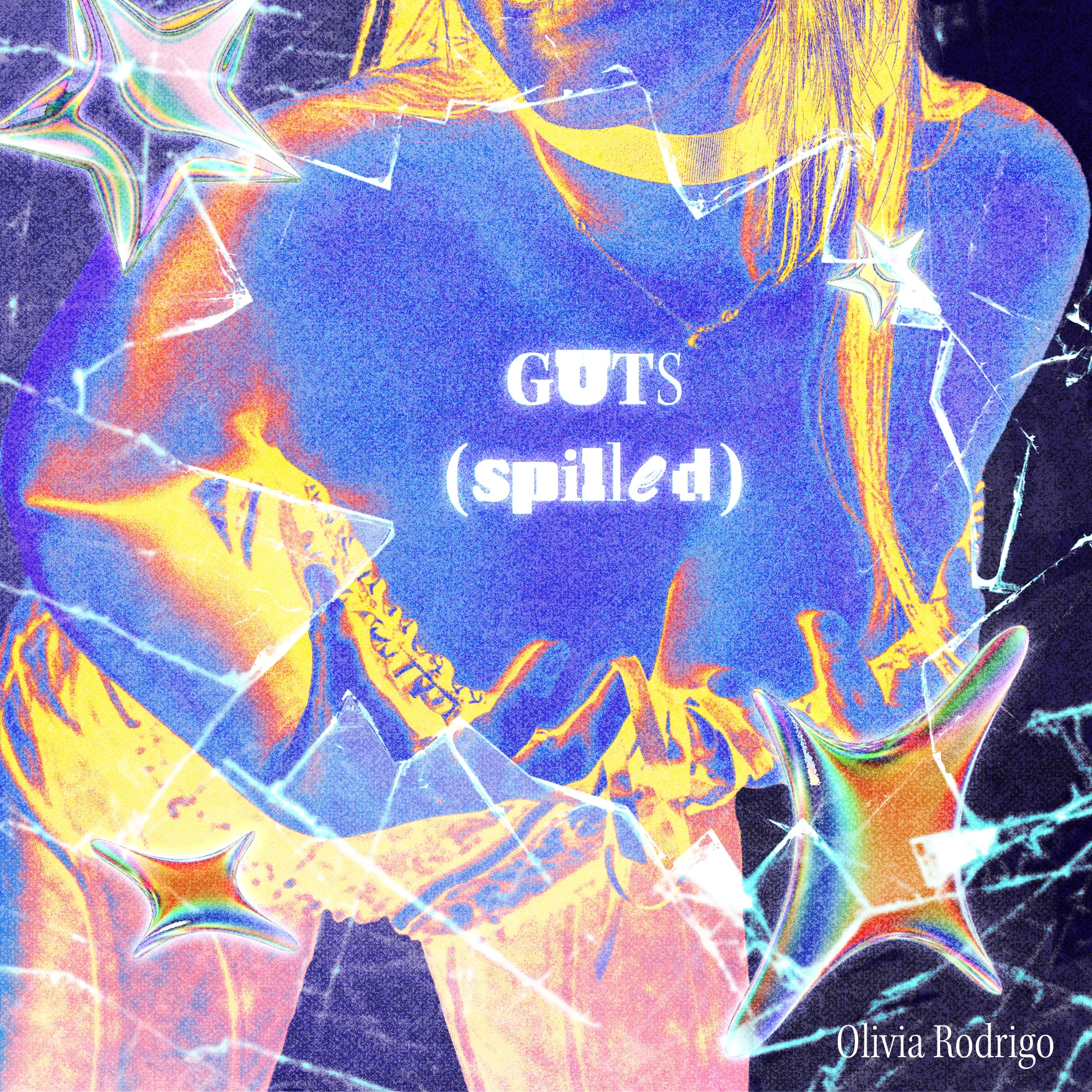
This treatment set the visual tone for the rebrand and began with a planned photoshoot guided by a detailed shot list. I edited the photos in black and white first to control how the gradient map reacted to light and shadow once colour was added.
The final look used a thermal-style gradient, grain, high contrast, and lens leaks. These choices introduced early-2000s digital textures, creating a mix of intensity and emotion that aligned with the album’s themes and shaped the overall direction.
DEVELOPMENT
*
DEVELOPMENT *
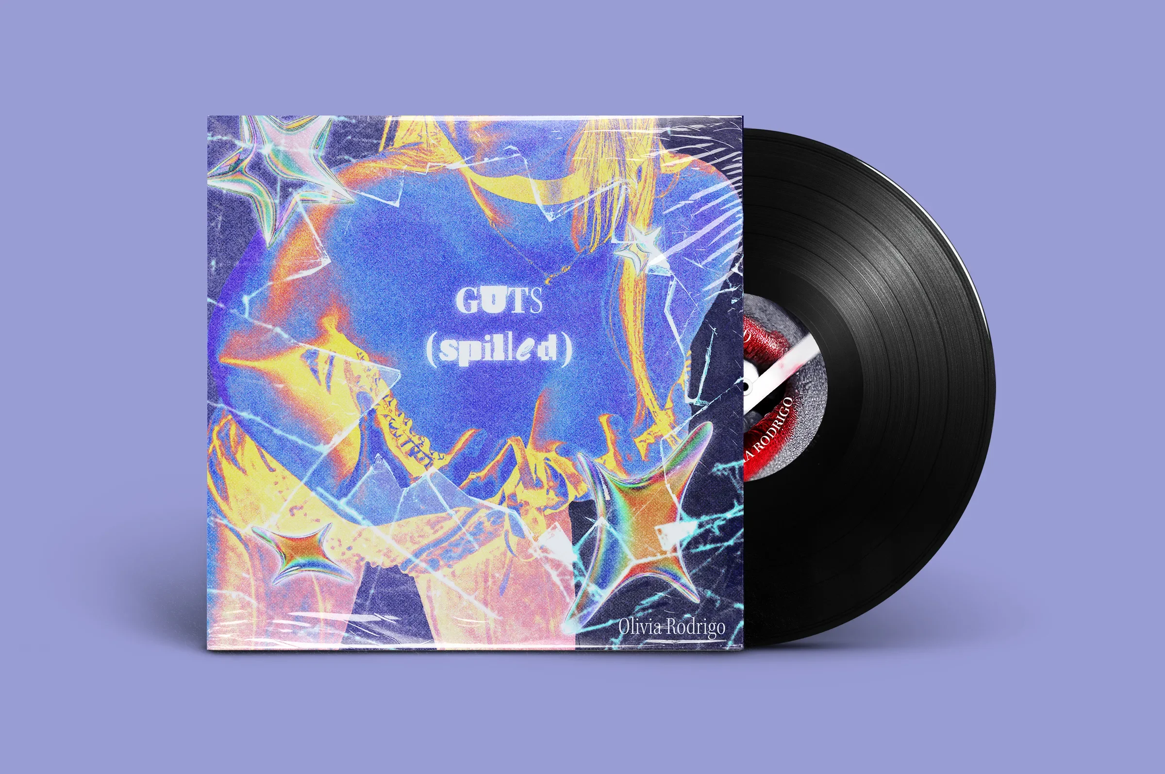
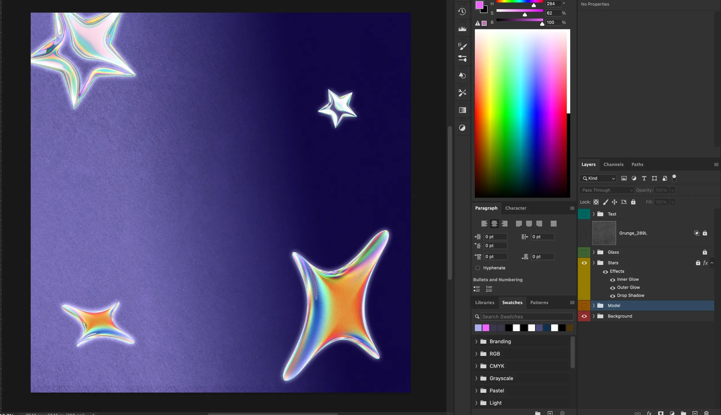
3D Stars
The 3D star treatment was developed from my Visual Direction Moodboard, which explored Y2K-inspired visuals, glowing effects, pastel colour palettes, and glossy digital forms. I chose to use stars because they helped add a playful, nostalgic, and dreamlike quality to the design while supporting the overall visual identity. Each star originally had a black background, so I used Photoshop’s Blend If settings in Layer Styles to remove the darker areas while keeping the brighter highlights visible. This allowed the pastel colours and white details to stand out more clearly. I then applied Inner Glow, Outer Glow, and Drop Shadow effects to a grouped set of stars, creating a soft glowing finish that strengthened the Y2K direction across the final design.
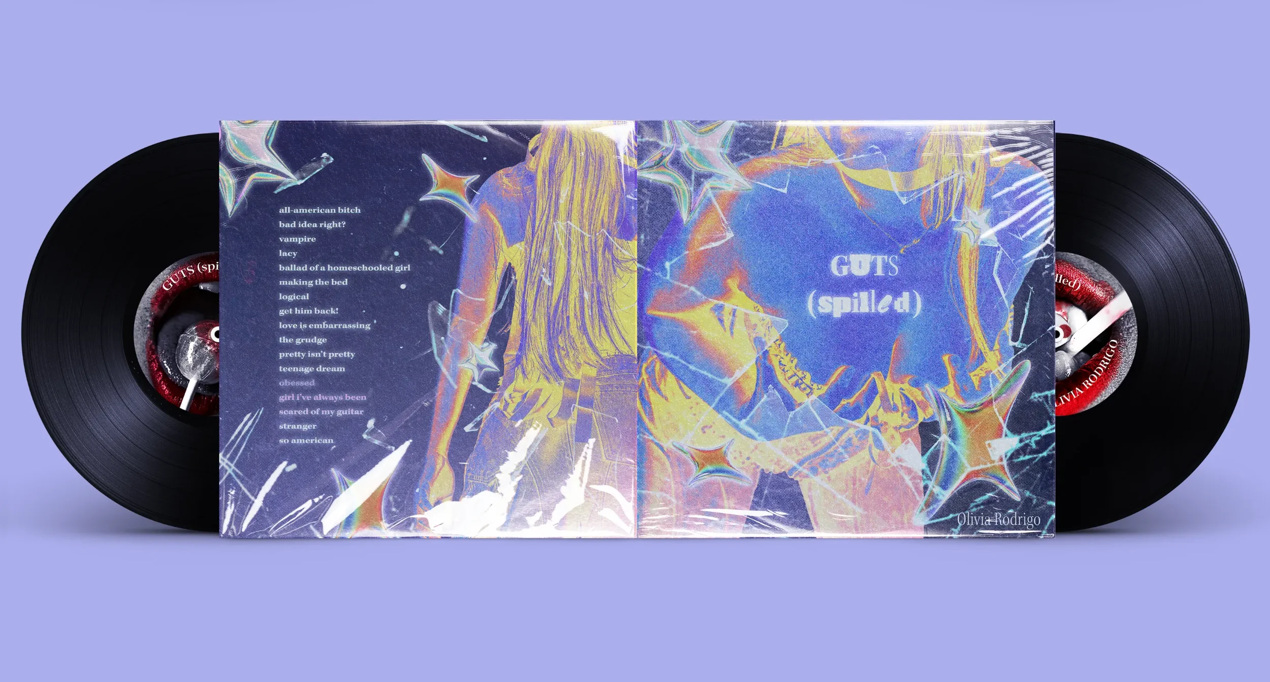
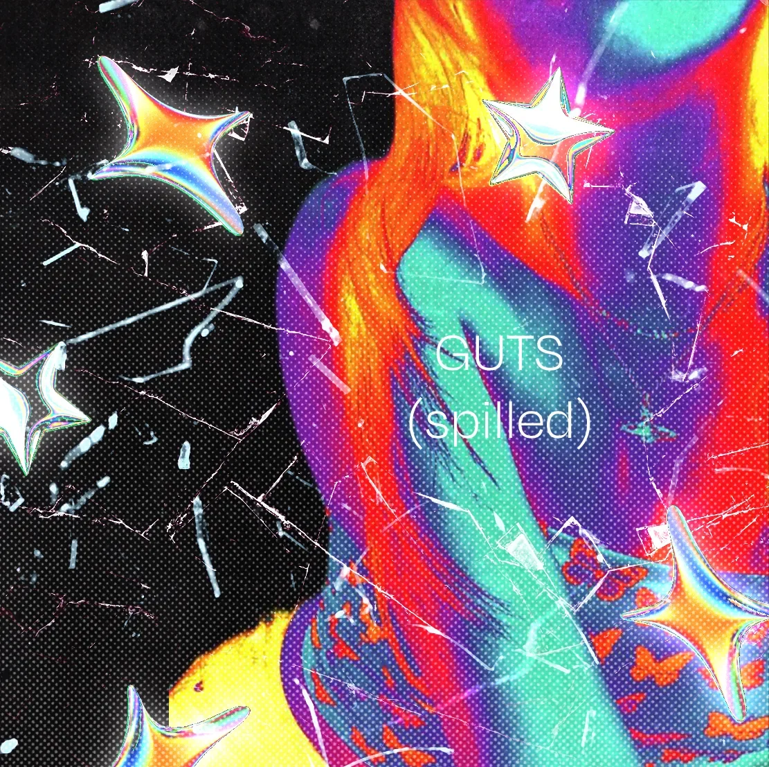
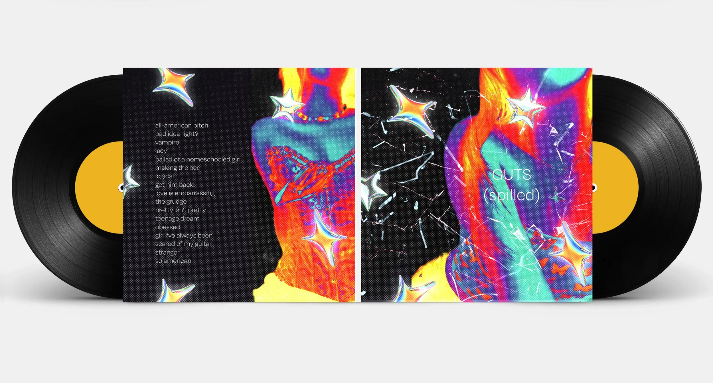
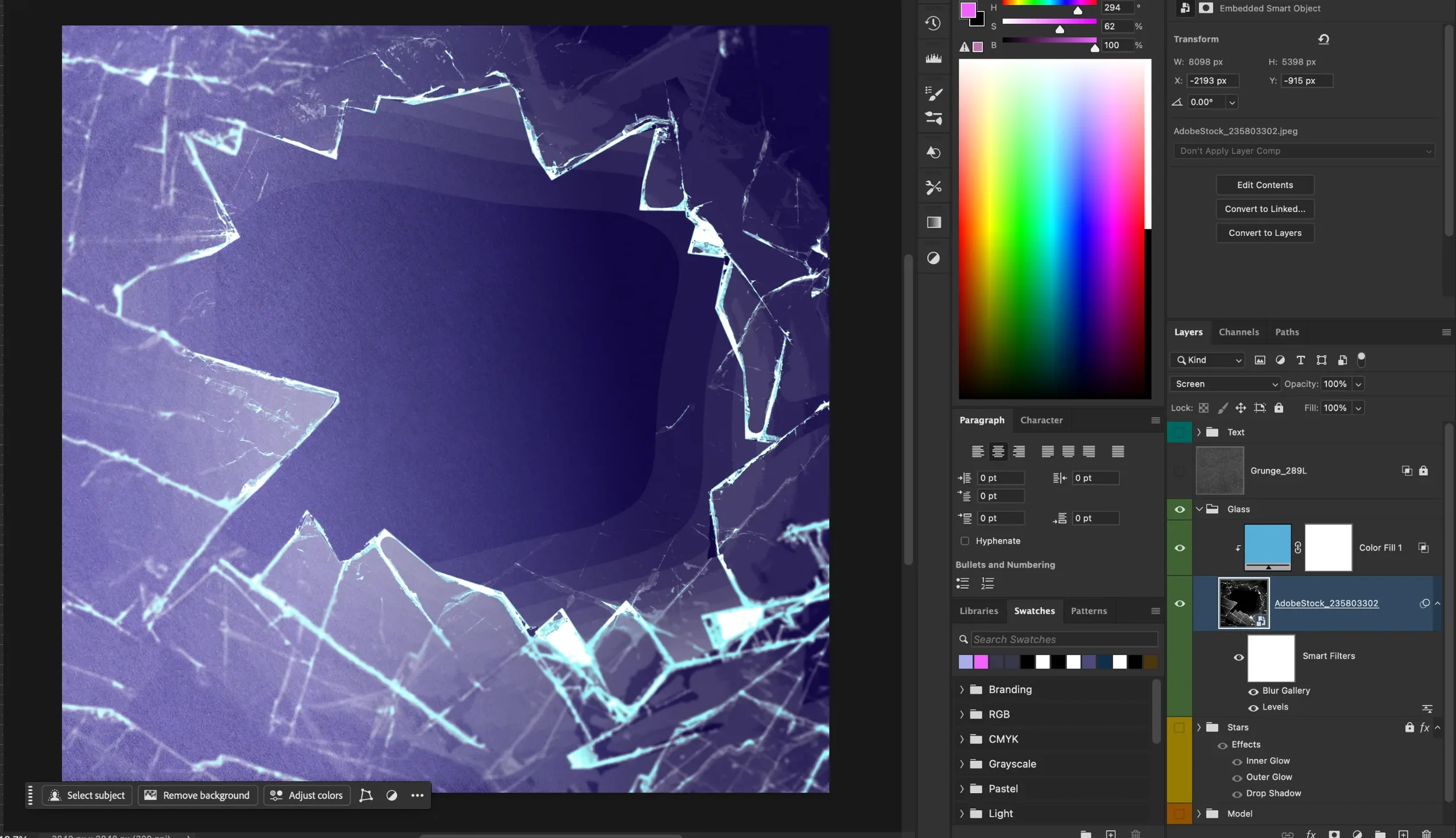
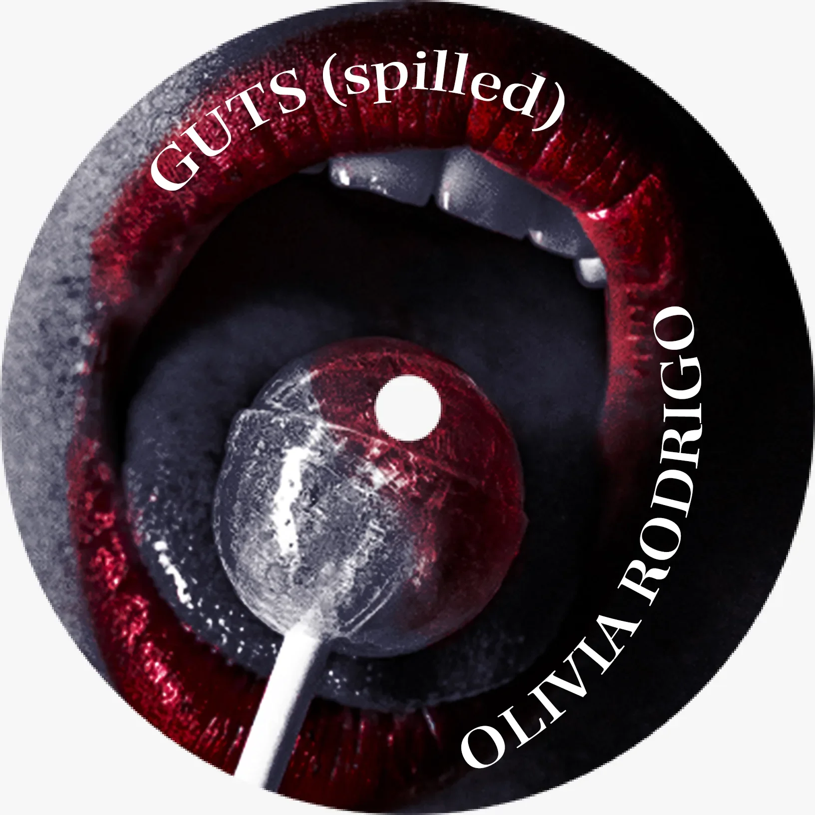
Glass Break
The glass imagery used across the front and back covers was treated consistently to create a cohesive visual system. The original image had a black background, but because I wanted to retain the shadows and depth within the glass, I used the Screen blending mode instead of removing the darker areas entirely. I converted the image into a Smart Object so I could apply non-destructive Smart Filters, including a Levels adjustment to refine the lighting and a Radial Blur to create a softer, more dynamic finish. To enhance the glass and give it a stronger blue tone, I added a colour fill using #56ADD6 with a Linear Light blending mode, helping the glass feel more realistic while still fitting the overall visual direction.
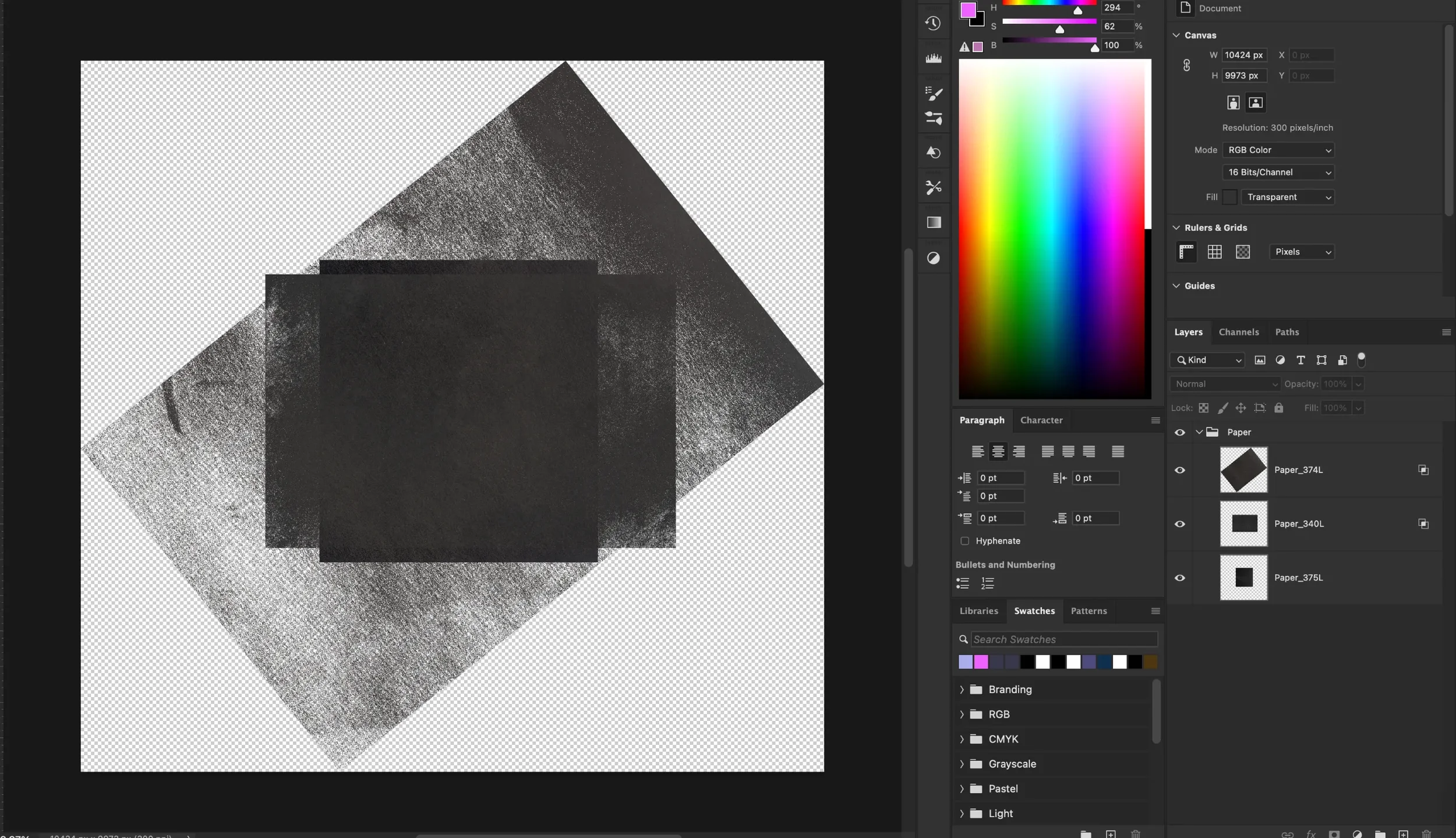
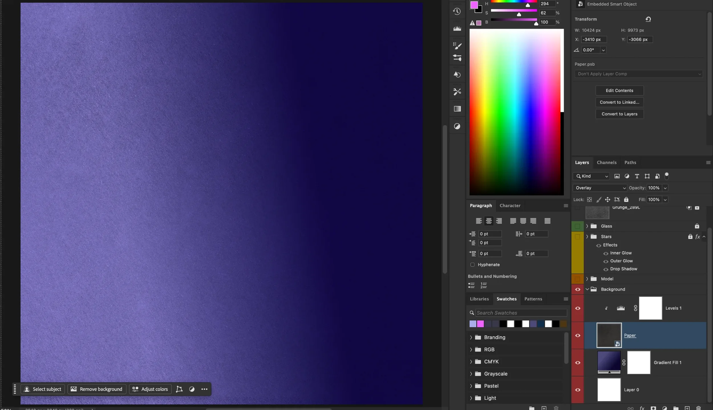
Background
The final background was built using a paper texture as the base, with a clipped levels adjustment applied to brighten the surface without affecting the rest of the composition. A grunge halftone overlay was then added to strengthen the punk-inspired visual direction and create a rougher, more tactile finish. The gradient was adapted from the original album artwork, allowing the redesign to retain a subtle connection to the source material while moving away from its existing imagery. Combined with the new layout, texture, and visual treatment, the background helped connect the rebrand back to the original album while establishing a distinct new identity.
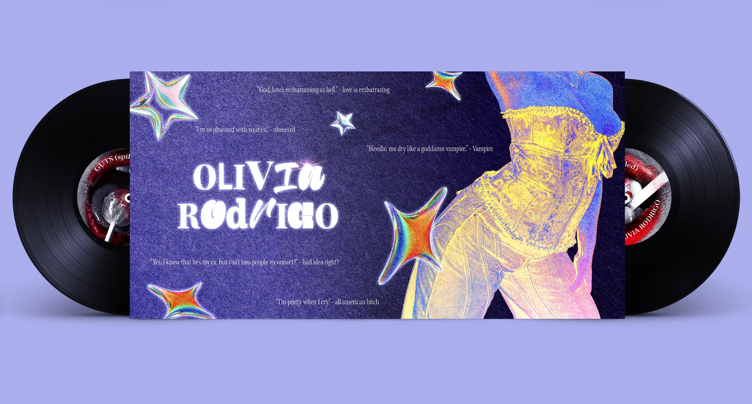
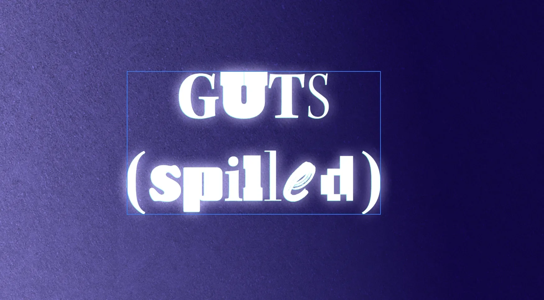
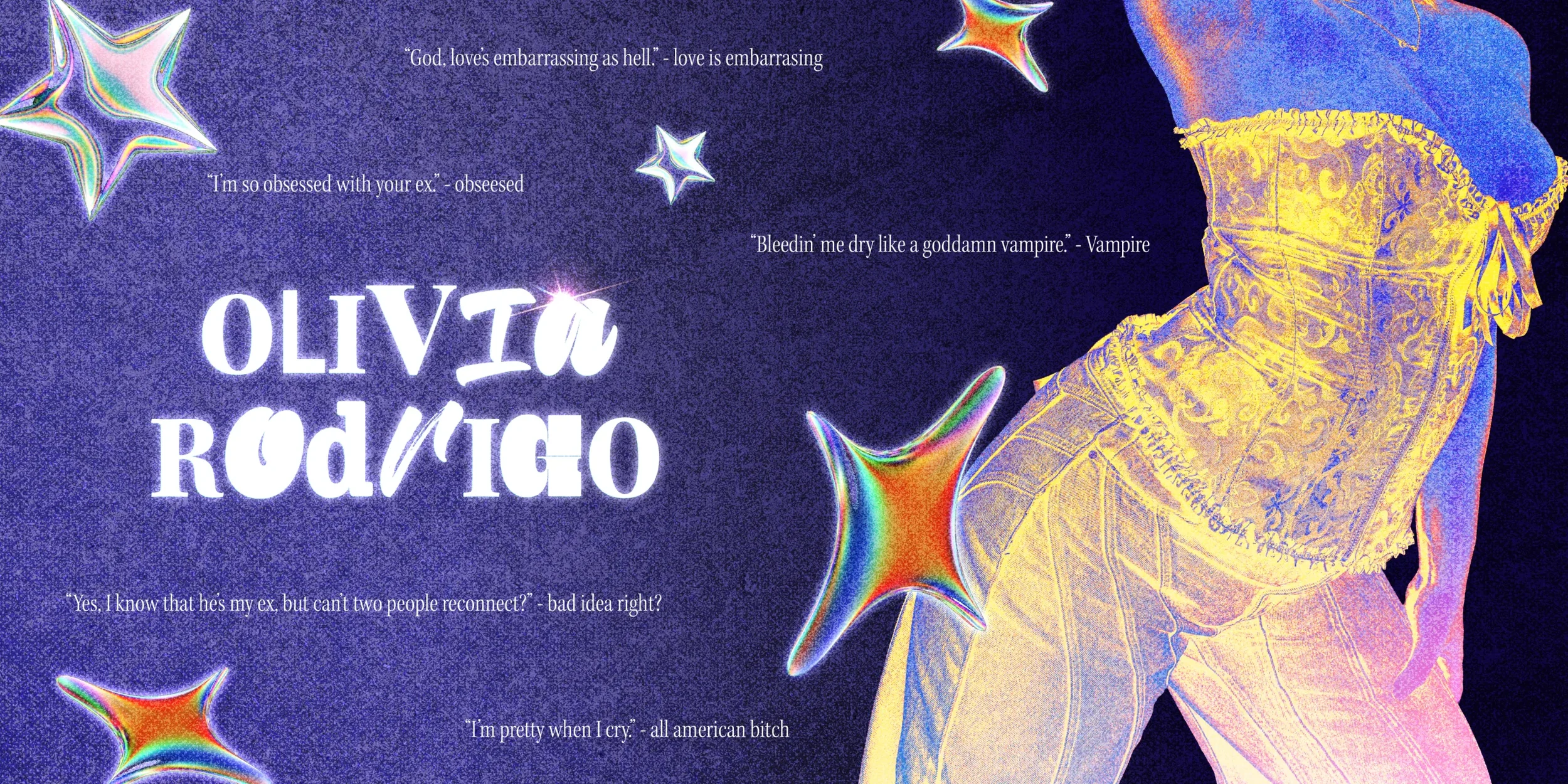
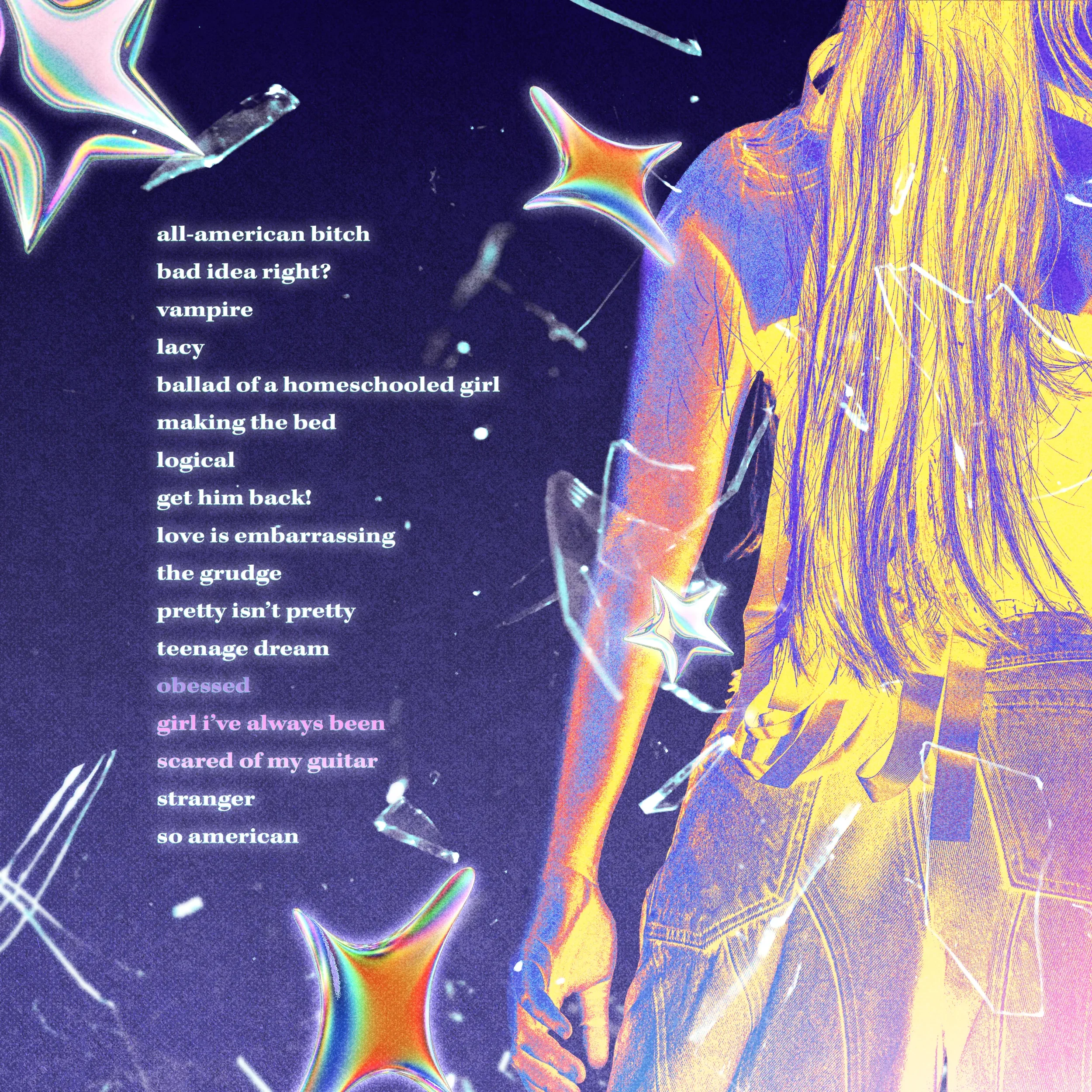
Typography Treatments
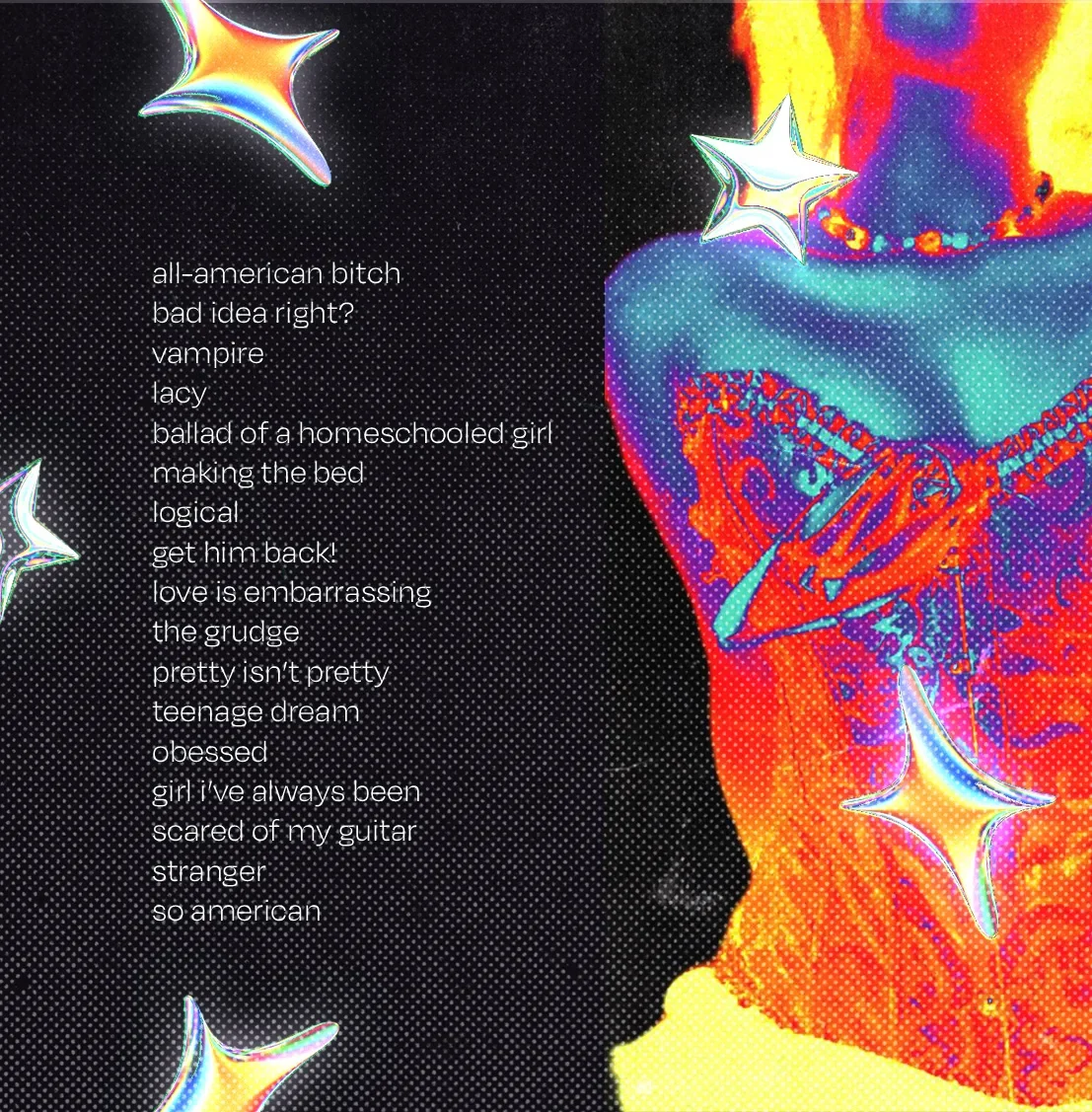
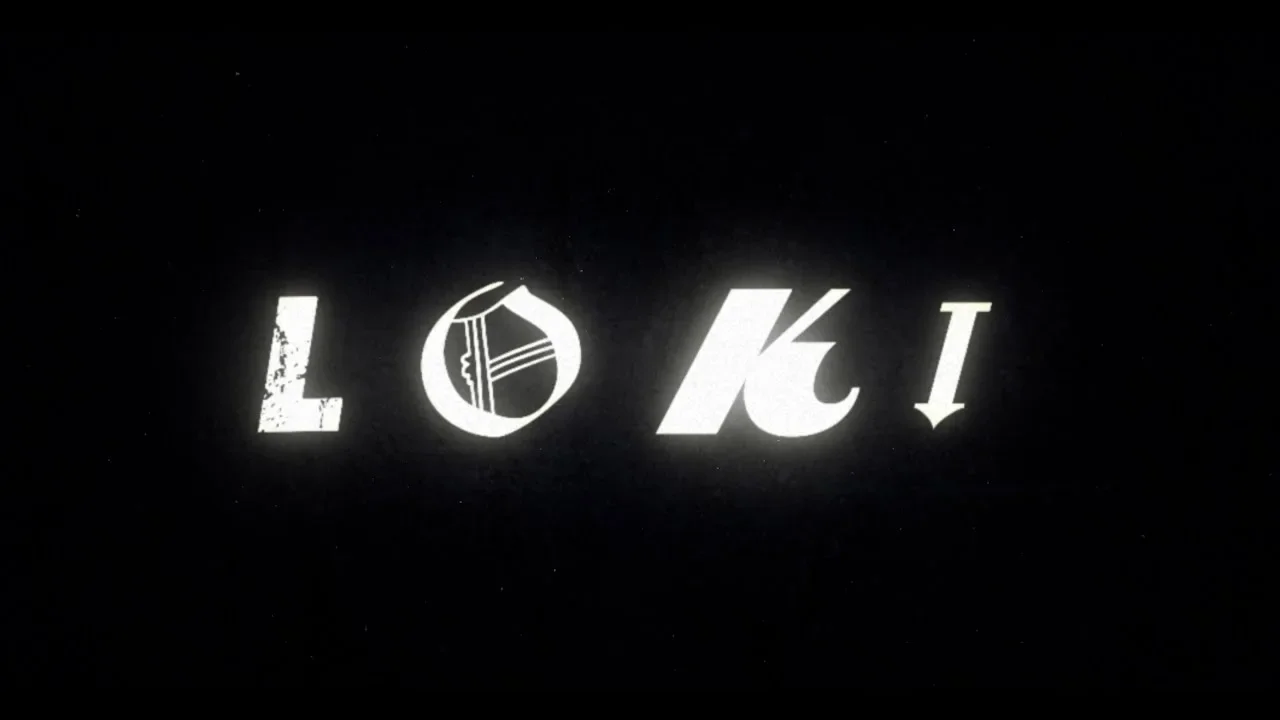
The mixed-letter title sequences inspired the typography treatment in Loki. I used Kepler as the base font and paired it with contrasting typefaces so each letter had its own personality and slight unpredictability. The addition of glow effects and custom layer styles was not just a design choice, but a deliberate move to inject dynamism and energy into the lettering. These effects added depth, colour, and a soft luminous edge that supported the Y2K direction and helped the lettering feel more active within the layout.
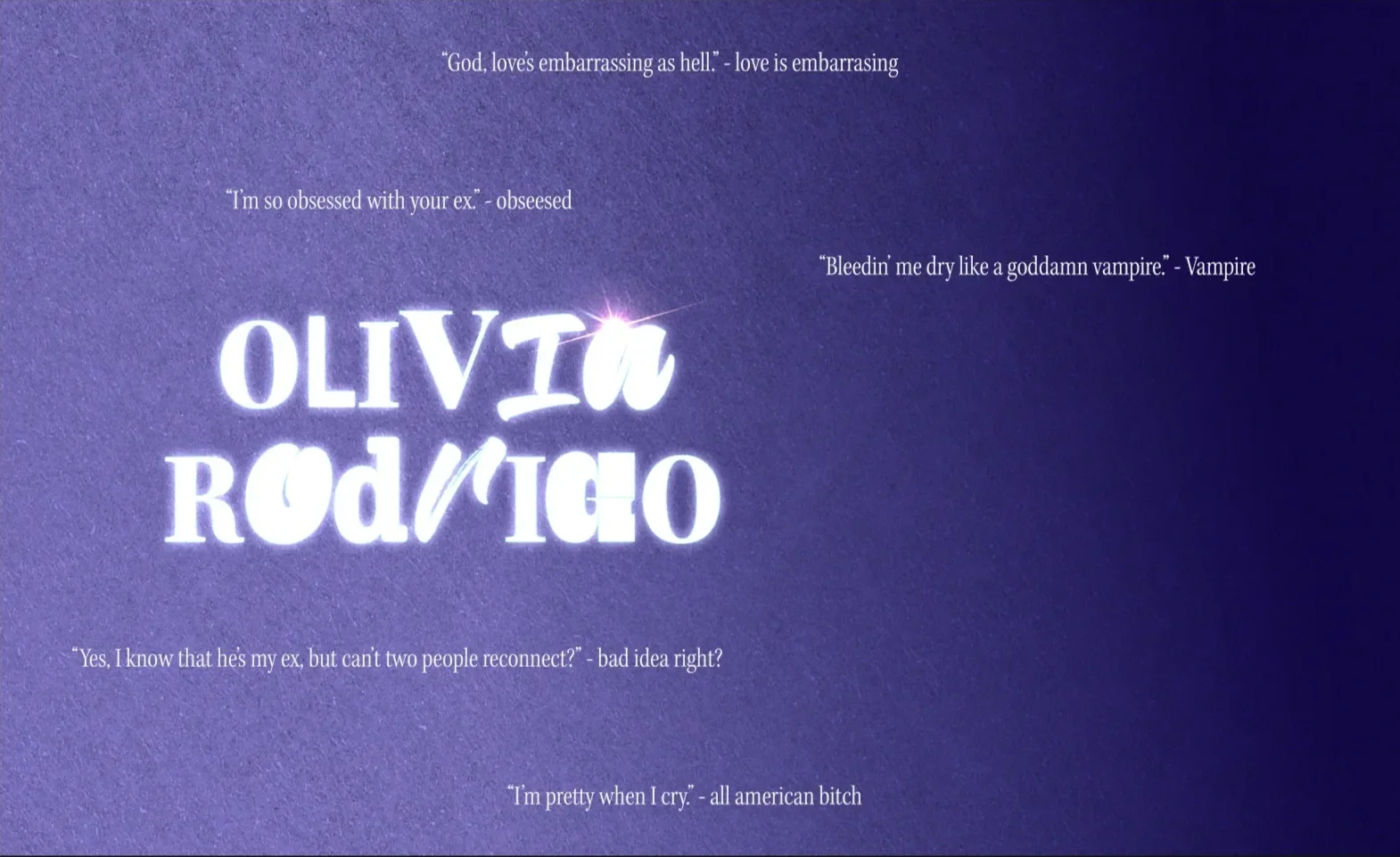
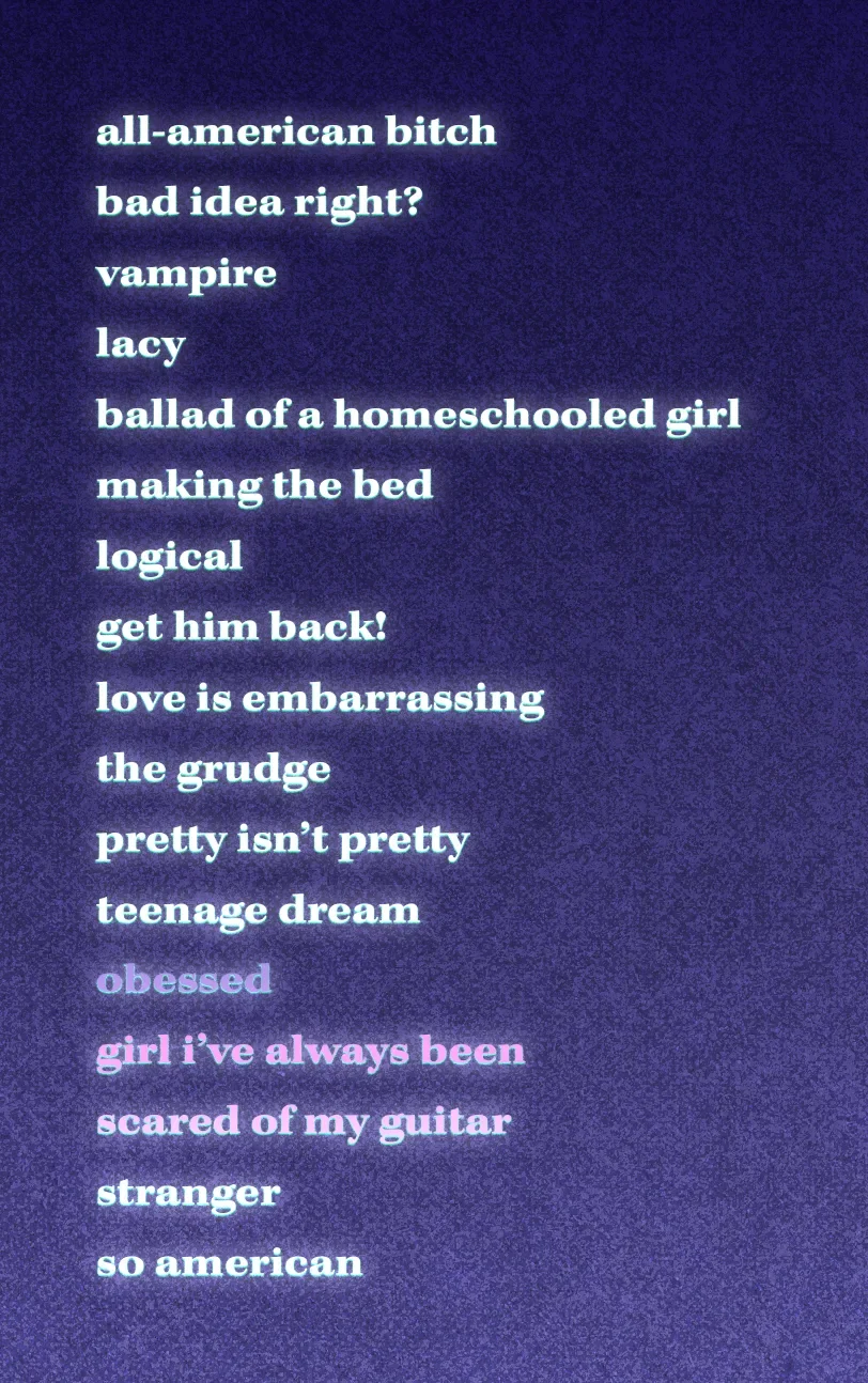
To maintain consistency, I applied this system across the titles, song list, and inner-fold lettering. To fill negative space without repeating the original vinyl layout, I creatively incorporated lyric fragments. This approach not only added a unique touch but also highlighted extended tracks for clarity. These choices resulted in a typographic style that felt expressive, polished, and closely tied to the overall visual tone of the rebrand.
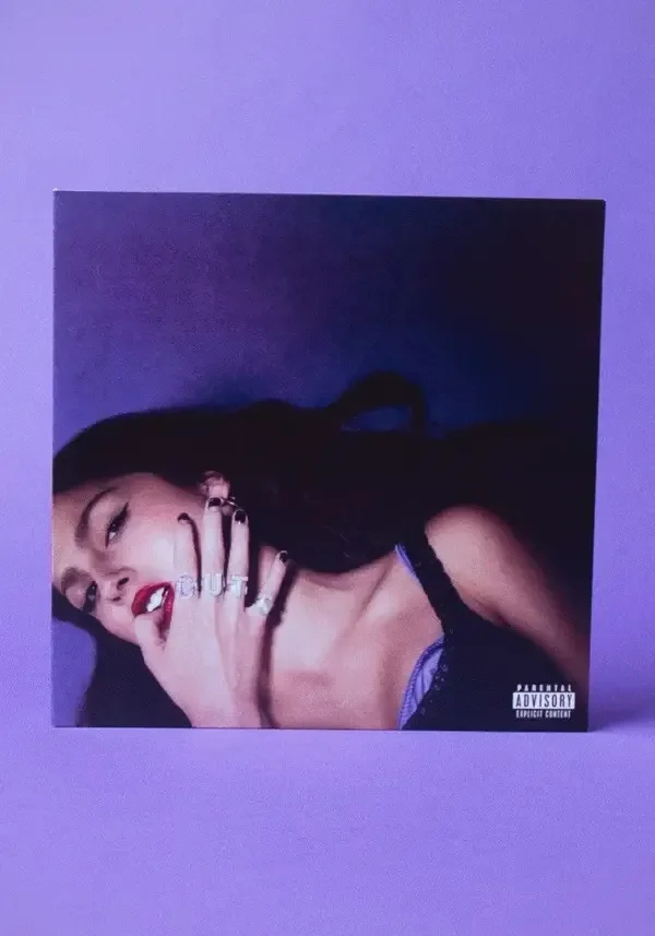
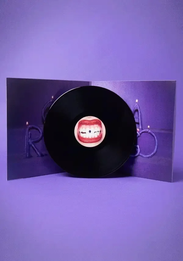
Final Artworks
*
Final Artworks *
Final Artworks
Artwork Mockups
PROJECT STATEMENT
*
PROJECT STATEMENT *
This project reimagines Olivia Rodrigo’s GUTS (spilled) album through a new visual direction inspired by Y2K design, thermal colour treatments, grunge texture, and a strong typographic personality. The aim was to shift the tone of the original album imagery while still maintaining a clear connection to its themes of emotion, intensity, youth, and vulnerability. Through art direction, layered colour, tactile textures, glowing digital elements, and expressive photographic treatments, the rebrand creates a louder and more visually charged identity.
The project combined planned photography, experimental image editing, and a flexible typographic system to explore how an album’s visual language can be transformed while still respecting its core narrative. Through this process, I developed a design direction that balances nostalgia with a bold contemporary style. The final treatments, typography, and layered compositions work together to create a cohesive rebrand that feels playful, emotional, and visually intense.